
The viewer of a piece of art work needs a place to rest their eye’s, especially if their are too many overwhelming vibrant colors. Many master artists are aware of this and plan, create and utilize harmonious grays within their paintings. A good example of this is in the thumbnail painting to the left by Paul Cezanne, who was a master at working his neutral grays into his paintings. He also used his grays to make surrounding colors even more vibrant in comparison.
Tip: An artist can create their own grays utilizing colors in the painting by mixing two complementary colors together, as well as combining all three of the primary colors. It is possible to control temperature and values of the grays by adjusting the ratio of the colors selected. Rather than mixing the colors, unique grays (with some mediums) can be created by layering colors one over the other. Using the old cliche, practice makes perfect, works especially well in creating grays. An artist needs to experiment, experiment, experiment.
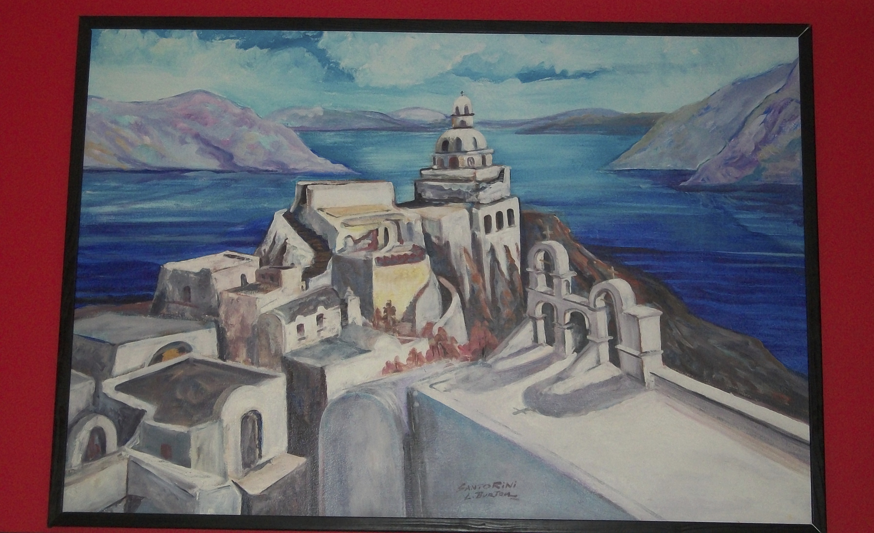
Remember, just as complements side by side in a painting will intensify each other, mixing complementing colors will make their complement disappear. In the disappearing stage of the mixing experiment, an artist can take the neutral grays produced and keep them for the painting by creating values and temperatures. Also, depending on the hues of the main colors and amount of the mix, many interesting colors can be produced; such as, in the painting to the right by artist, Lynn Burton.
My advise is do your palette mixing in advance when creating neutral and harmonious grays. Mix your warm and cool grays, and with varying values. It will become much simpler with the grays already mixed when needed to tone down hues and chroma. Once created, the grays then can mix with white or black to create a value scale. Add a warm color to it and the neutral gray will become warm. Add a cool color to it and it will become cool.
Be sure to sign up for the Art Center Information newsletter at the upper right of the post. Enter the drawing for the fabulous Splash book.
Comments are welcome at the bottom of the post.