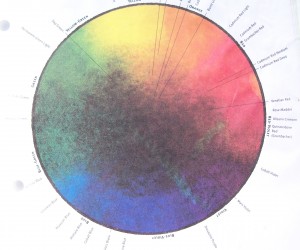
So often as artists, we tend to feel we naturally know how to mix colors and use them in the scheme of our paintings. However, from time to time it is important to whip out the color wheels and check ourselves depending on what we wish to accomplish. For example, when trying to express ourselves in a harmonious painting, there are a variety of beautiful colors found on the triadic color wheel.
I have often found it necessary to refer to these different colors needed on the wheel.
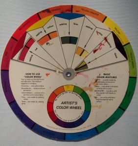
- Primary Color Scheme: Red, Yellow, and Blue. You can use primaries to neutralize a color or side by side to make a statement.
- Secondary Color Scheme: Orange, Green, and Violate. These adapt well with landscapes. In your different color scheme use, allow one color to be dominant. With green and oranges, you can see how this would be perfect for your nature scenes.
- Tertiary Color Scheme: (1) Yellow-Green, Blue-Violet, and Red-Orange, or (2) Yellow-Orange, Red-Violet, and Blue-Green. As with the other color schemes, one of the colors should be dominant.
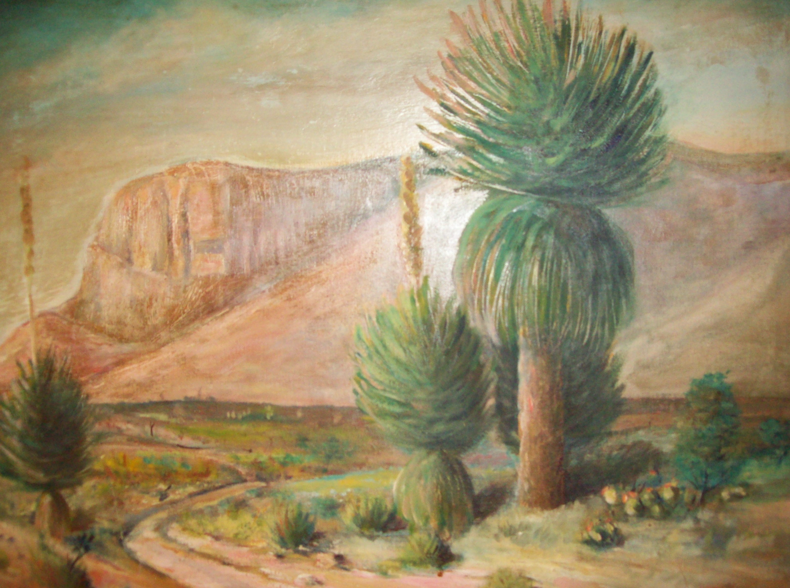
Below is a painting my father painted many years ago of Signal Peak (a mountain in New Mexico). I especially like the colors he used in his landscape composition.