Painting on Arches 300-lb 22″X30″ watercolor paper
When selecting the paper you paint your watercolors upon, select wisely. The success or failure of your painting often depends upon the paper. Because there are many differences among papers, you should experiment with many of them rather than settle early on just one or two in which you feel comfortable.
This article discusses paper sheets, but there are many papers sold in tablets and pads; most of these are light weight and of less quality. However, they are great to carry around to make watercolor sketches.
Some watercolor papers are soft (blotter like), and others are slow to absorb. Some dries quickly, and some will allow a good deal of abuse; such as, scrubbing and erasure techniques. When you experiment with different paper types, you will learn to use different ones for different kinds of paintings.
Paper Weights~refers to paper weight in pounds of a ream (500 sheets) of that paper.
Richard D.Burton: “Winter Farm” (Arches: 140lb rough)
The nature of the surface of the paper is highly important. It deserves more attention than it generally receives. Most artists habitually uses a very small number of the recognized makes and limit the scope of their work.
From the coarsest to the smoothest surface, almost any surface can be used with good effect. Each can be induced to display special charms by adopting suitable subjects, techniques, and methods. For example, a wash on a coarse paper will appear darker than if painted on a smooth paper; as if thousands of dots of color, slightly darker than the wash, had been added
To summarize, Watercolor papers come in three surfaces: rough, cold pressed, and smooth (hot pressed). For the use of bold technique, the rough is best. For general purposes, the cold pressed is best. The smooth (hot pressed) takes skill and is rarely used except by experienced professionals. For any serious person wishing to become good at painting with watercolor, it is best to practice with all the types of watercolor paper. It really does come down to personal taste.
R. D. Burton: Fishing the Everglades~Watercolor (16″X28″) Arches 300-lb
See R.D. Burton’s paintings in the Burton Family gallery.
You can check some of Lynn Burton’s paintings out at the top of the page in his Gallery.
Be sure to join the ART CENTER INFORMATION newsletter. You might win a beautiful art coffee table book, Splash 14. Upper page at right.
Check out the Great Opportunities page at the top.
Be sure to like us on our Facebook Page at the right.
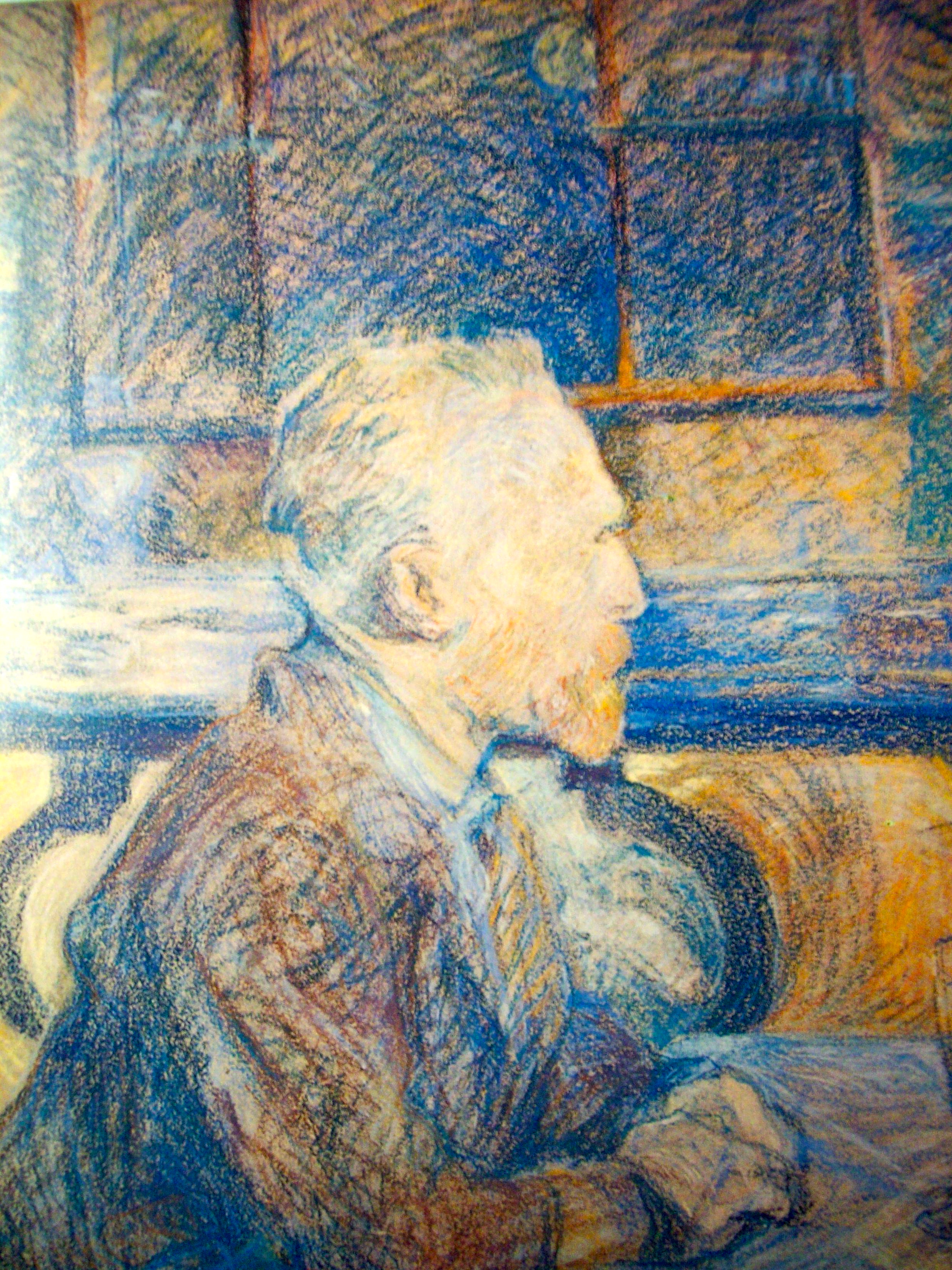
Henri de Toulouse-Lautrec: Portrait of Vincent van Gogh
What is drawing? It is working oneself through an invisible iron wall that seems to stand between what one feels and what one can do~Vincent van Gogh
As with all his art, Vincent van Gogh brought to his drawings a mastery of style and an extraordinary technical facility. Because of this, much of his graphic works are as strong as his best oils. Over all, his works sprang from his overpowering, energetic, creative impulses.
Van Gogh had the ability to give his drawings depth, resolution, and a certain feeling of color, even though they were black and white. He did this with the way he used line and dot strokes. As with his paintings, any person studying his drawings can not fail to see the energy expended.
Other artists acquainted with Van Gogh often became influenced by the power and intensity. One such artist was Toulouse-Lautrec who painted Van Gogh sitting at a cafe table, using much of Van Gogh’s technique using bold colors and closely knit,hatched strokes
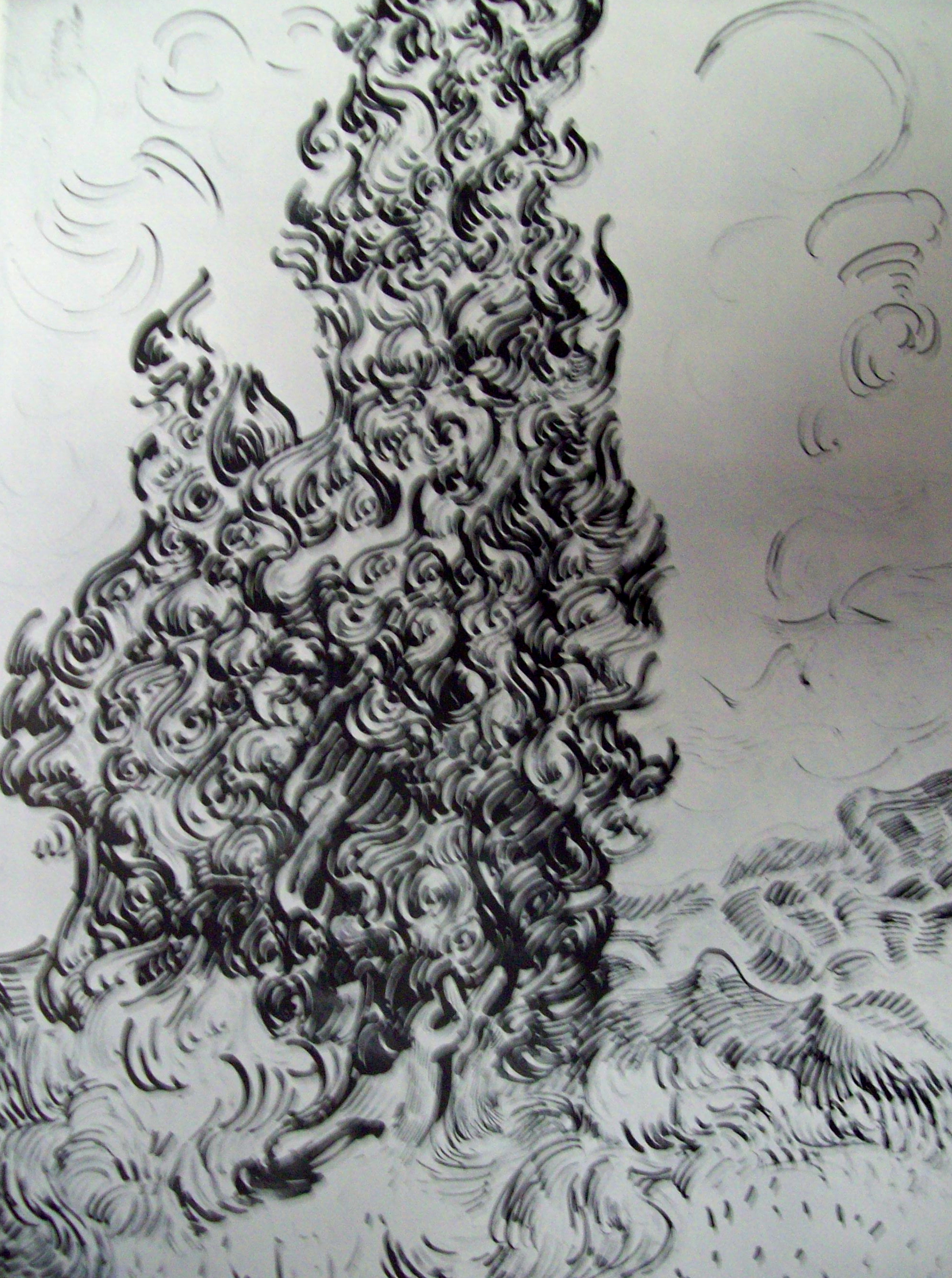
Vincent van Gogh: Cypresses, Saint-Remy (1889) – Drawing
Vincent sketched cypress trees while he was at the asylum at Saint-Remy, finding them a “turbulent vitality in their graceful shape and mass. His drawings of the trees show the dynamic spirals, curlicues and undulating lines that characterize his later style.
Most all students studying art history know of the compelling work Van Gogh did in color. How he began to make an arbitrary use of color, seeking the exact harmonies that would (in his words)”express the love of two lovers by a wedding of two complimentary colors, their mingling and their opposition, the mysterious vibrations of kindred tones.” Without a doubt, he was obsessed with color. If one studies carefully his drawings (such as the one to the right), they almost feel while graphite touched the paper, the artist was considering how to mix the colors to use in the painting. This author feels Van Gogh painted this drawing over and over in his mind, seeing it clearly in his mind’s eye, imagining every thick brush stroke as it hit canvas.
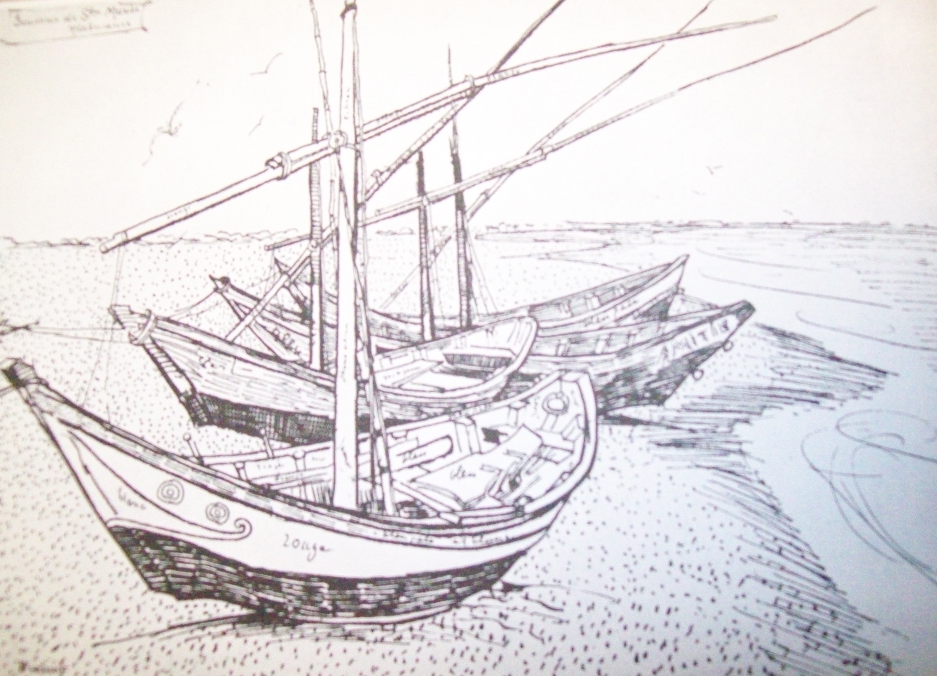
Vincent van Gogh: Fishing Boats at Saintes-Maries-de-la-Mer (1888)
The above depiction of art of Vincent van Gogh and Henri de Toulouse-Lautrec are simply photographs of photographs. They were used as information only. They are not to depict any value or worth.
You can check some of the Lynn Buton paintings at the top of the page in his Gallery.
Also, check out the Burton Family gallery.
Be sure to join our NEWSLETTER. By joining, you have a chance to win a beautiful art coffee table book, Splash 14. (Void where not permitted.)
Don’t forget, there are some recommended helpful art books in the Great Opportunities page at the top.
Be sure to like us by visiting our Facebook Page (at the right).
To visit a complete gallery of Lynn Burton’s Art, click on picture below and type in the name Lynn Burton in the search engine.
As when a tree’s cut down, the secret root live underground, and thence new branches shoot~John Dryden.
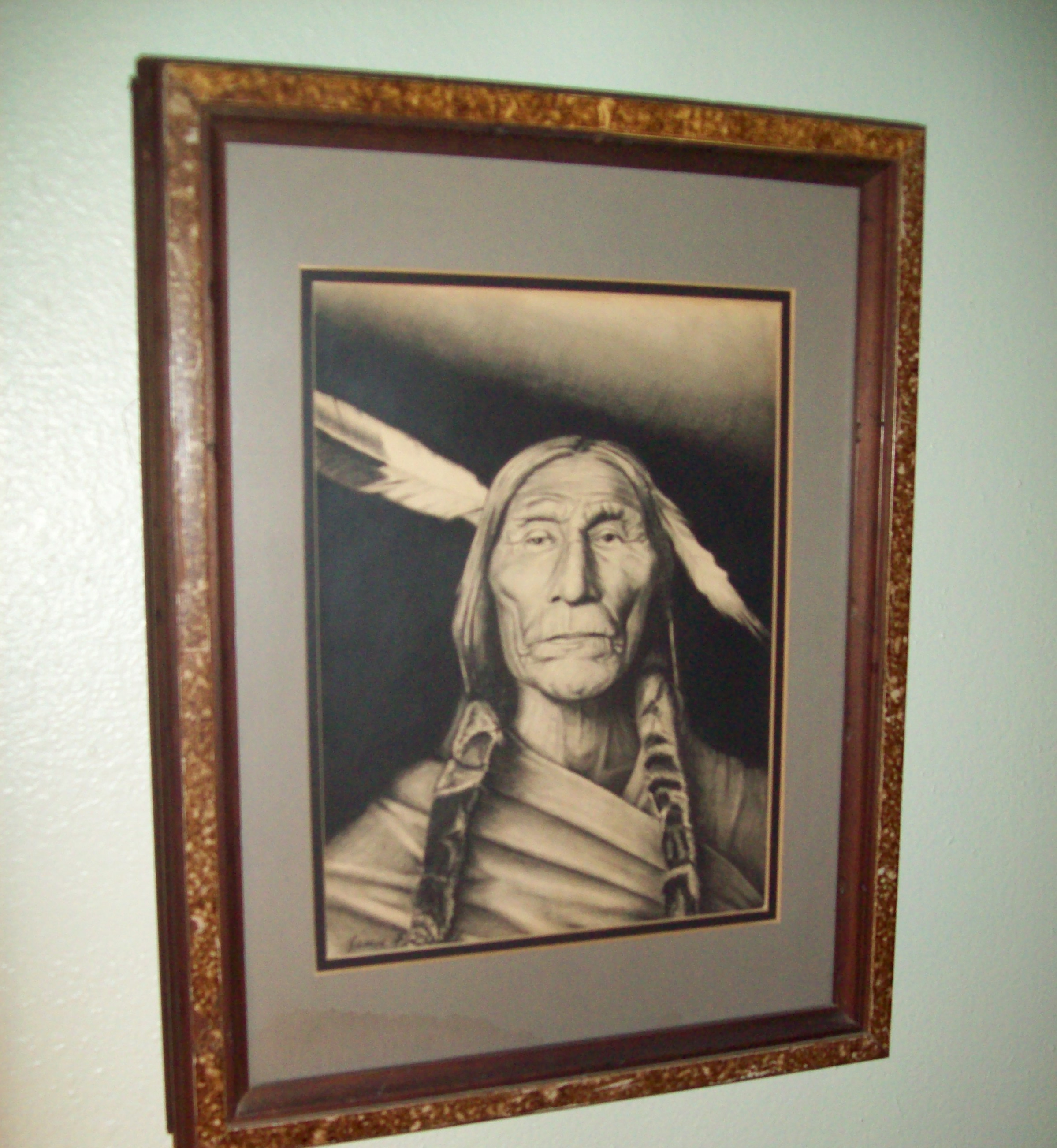
I’ll never forget the summer a few years ago, when I visited my daughter, my grandchildren, and my son-in-law in Texas. I especially wanted to spend the much needed time that I’d set aside for the too many things happening in my life that was tying me up, making me stressful. The stress was mostly coming from my fear of retiring at the time. I was in the process of deciding to spend the rest of my life with my art, and helping other artists promote and market their work. I wasn’t certain I wanted to do this, or simply retire, and fish, travel, and etc. The fishing and traveling part sounded very tempting. However, oft, we do not fearlessly step into the unknown. It was at this time that I had an opportunity to reacquaint myself with my son-in-law’s father, James Frederick…the great artist. I say great, not because he was a world-wide famous artist, but because after studying his works, I felt he should have been. Even at that time, I knew enough about art, and artists, to know what is good art, and what is not. I could tell at instant glance that James Frederick’s meticulous art work was superior. The works were decorating the walls all around his home. This was why I said the great artist…James Frederick.
I spent a good deal of time taking photos of his pictures (which are often posted on this blog sight). A few month’s before, I’d began my blog post, and I wanted to introduce the world to his works.
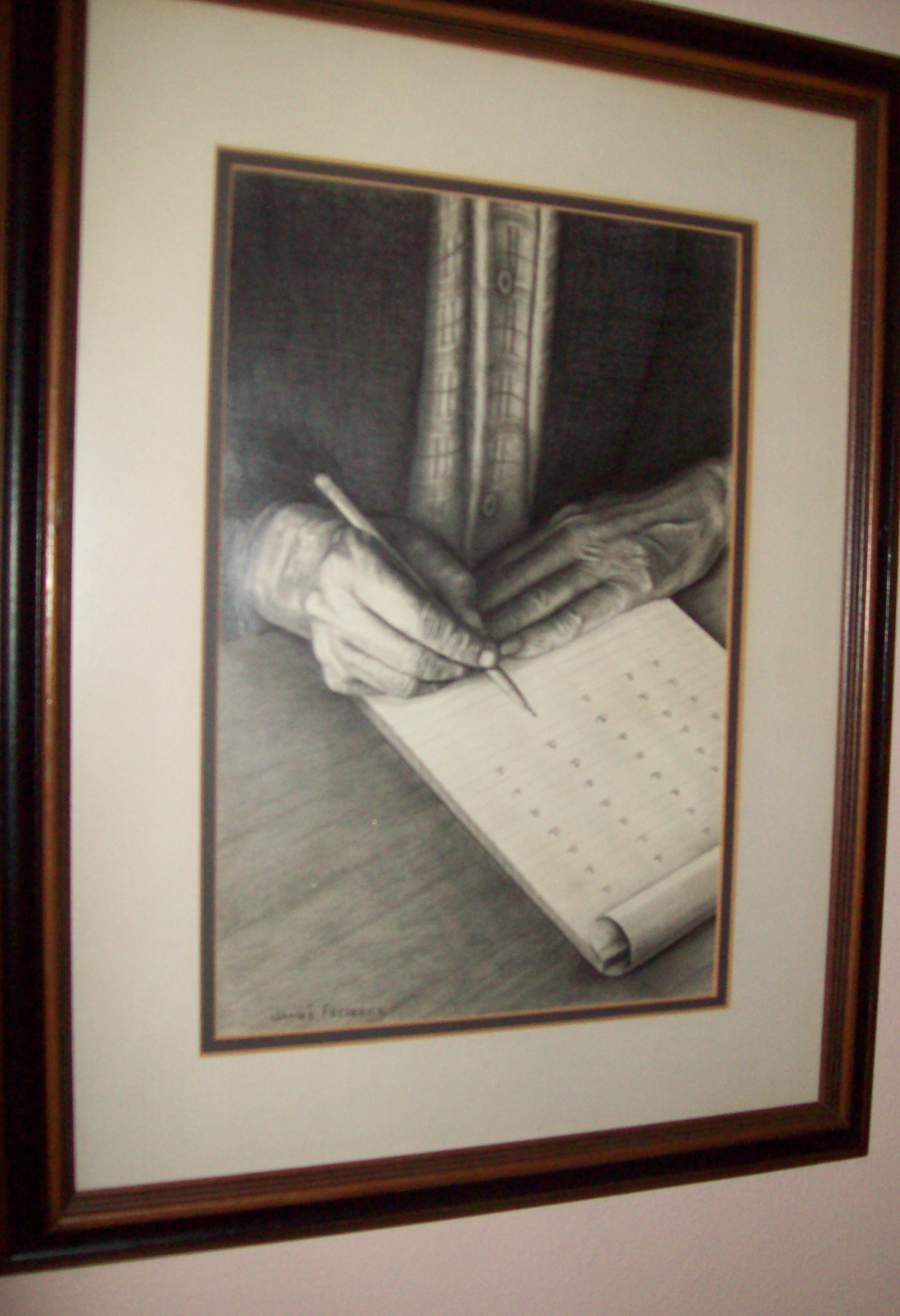
James Frederick: “Original American” Graphite on Paper
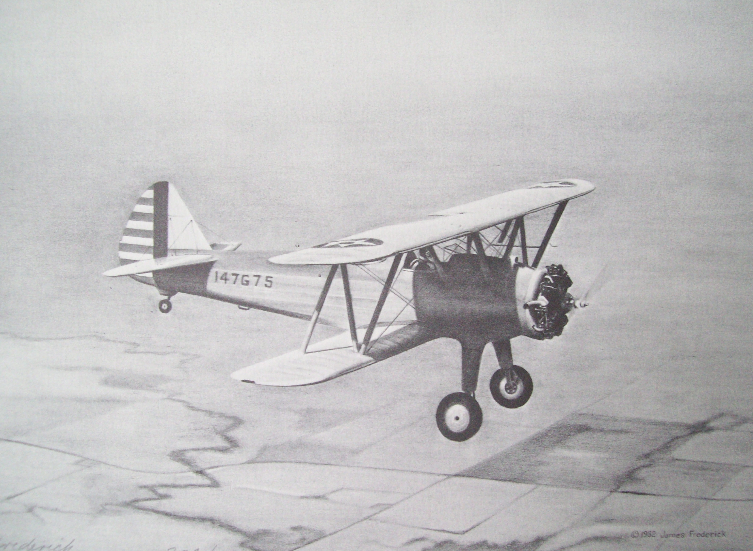
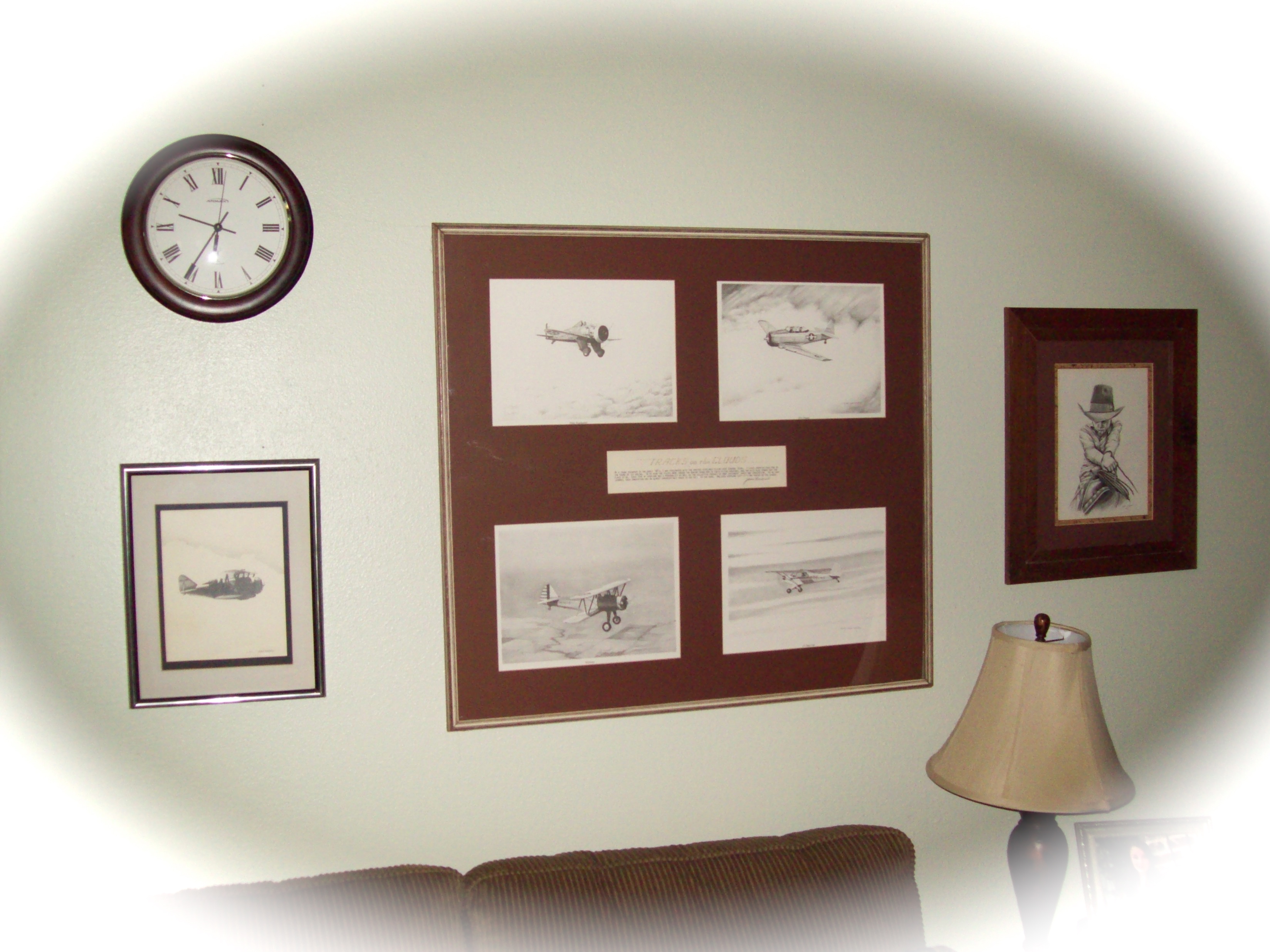
However, it wasn’t the artwork that was the only thing that inspired me, it was the conversations we had in the afternoons, sitting in rocking chairs, casually discussing some of his attempts to promote his works at fairs, and other public events. Promoting art was not easy for him, but it did often have a sense of satisfaction. We laughed when he discussed having won an art contest at the Smithsonian Institute for man’s air flight. He’d sent drawings of a group of four airplanes, matted together and framed. However, only one of the drawings won the contest. He refused to separate the drawings because he’d entered the contest with the four planes as one framed set. If they had to have the one, he would have to refuse the honor. He chuckled, and said: “They decided to keep them as a set, and I won the contest.”
James Frederick: Stearman (graphite on paper) SmithsonianArt of James Frederick
The photo on the wall does not give much detail of the drawings; however, the drawing on the right is one of the four. You can see why James would have won a contest with this drawing.
With great regret, less than a year after my visit that so inspired me to be more passionate about art, James passed. He was eighty years old. However, his art remains.
Below are a few other works of James Frederick…The Great Artist.
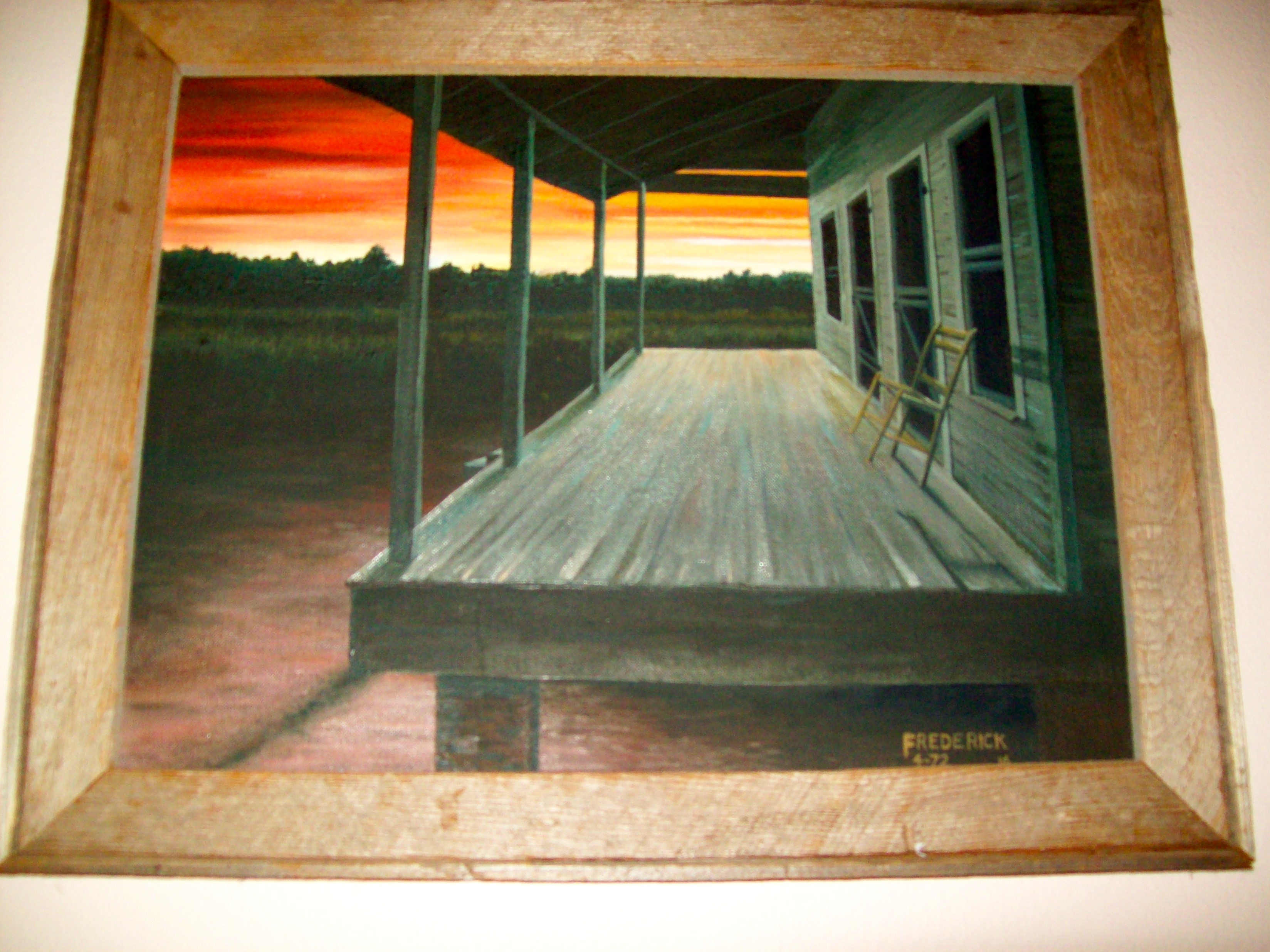
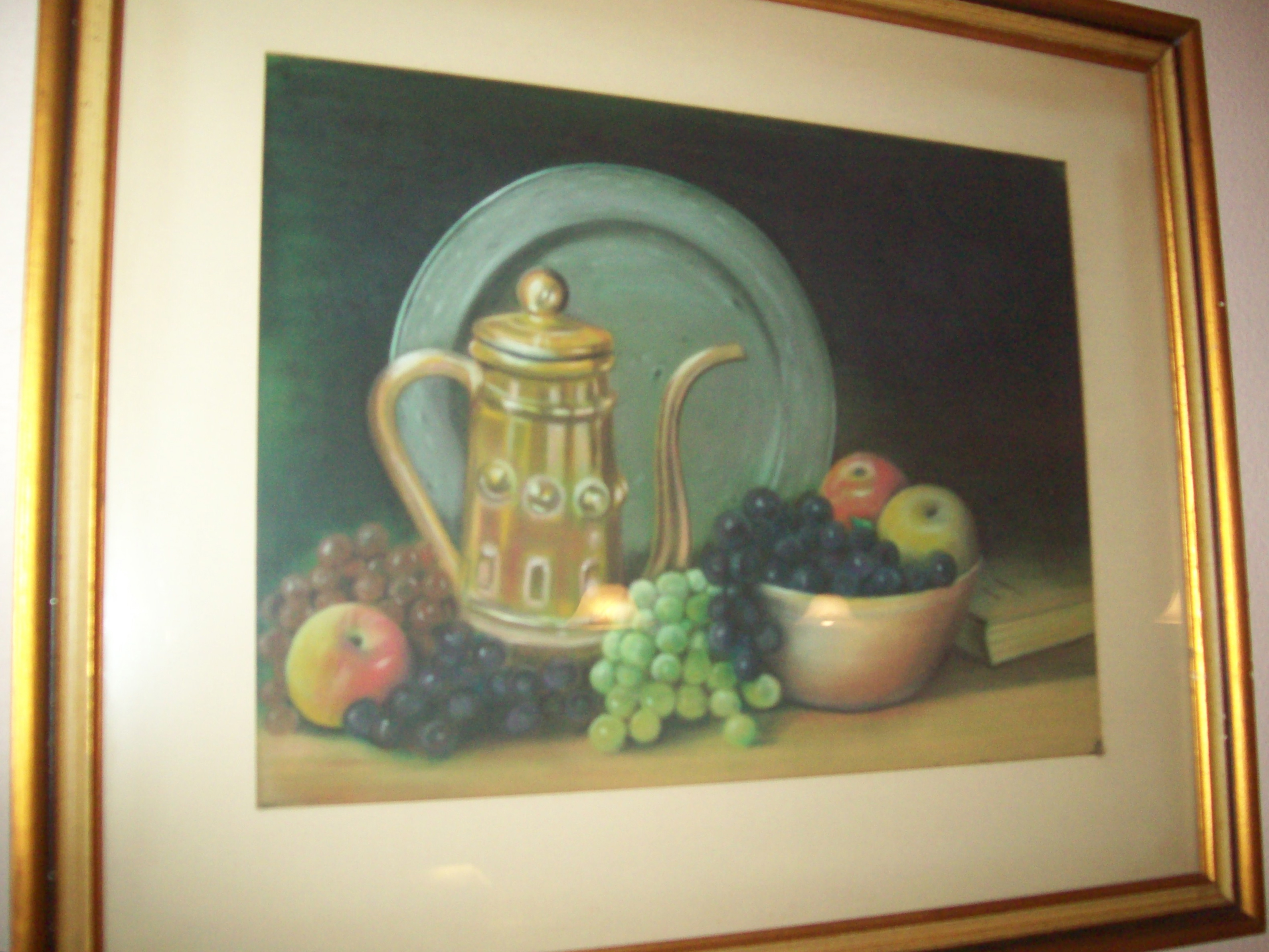
James Frederick :The Empty Chair (Oil on Board)James Fredrick: Plate, Fruit, and Coffee Pot
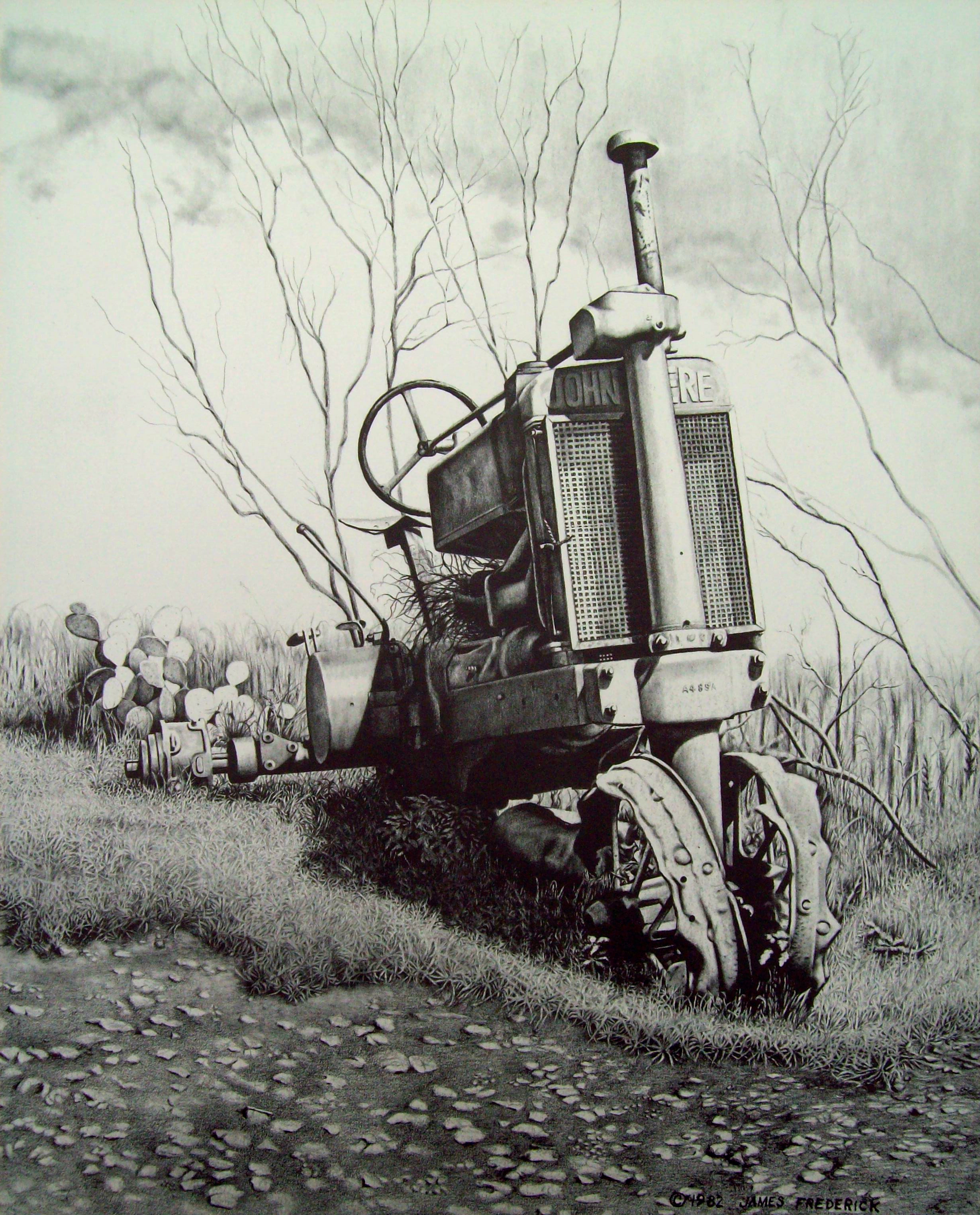
James Frederick: “Poppin’ Johnny” Graphite on paper
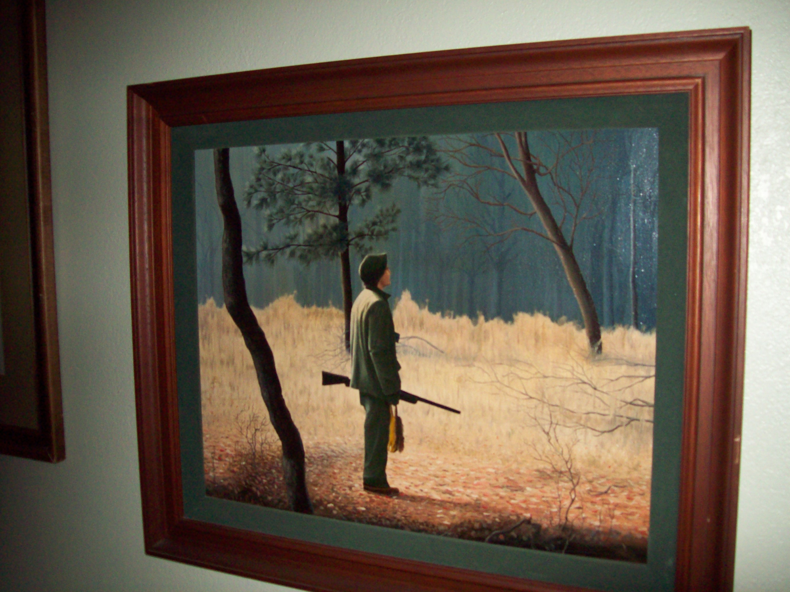
James Frederick: “The Squirrel Hunter”
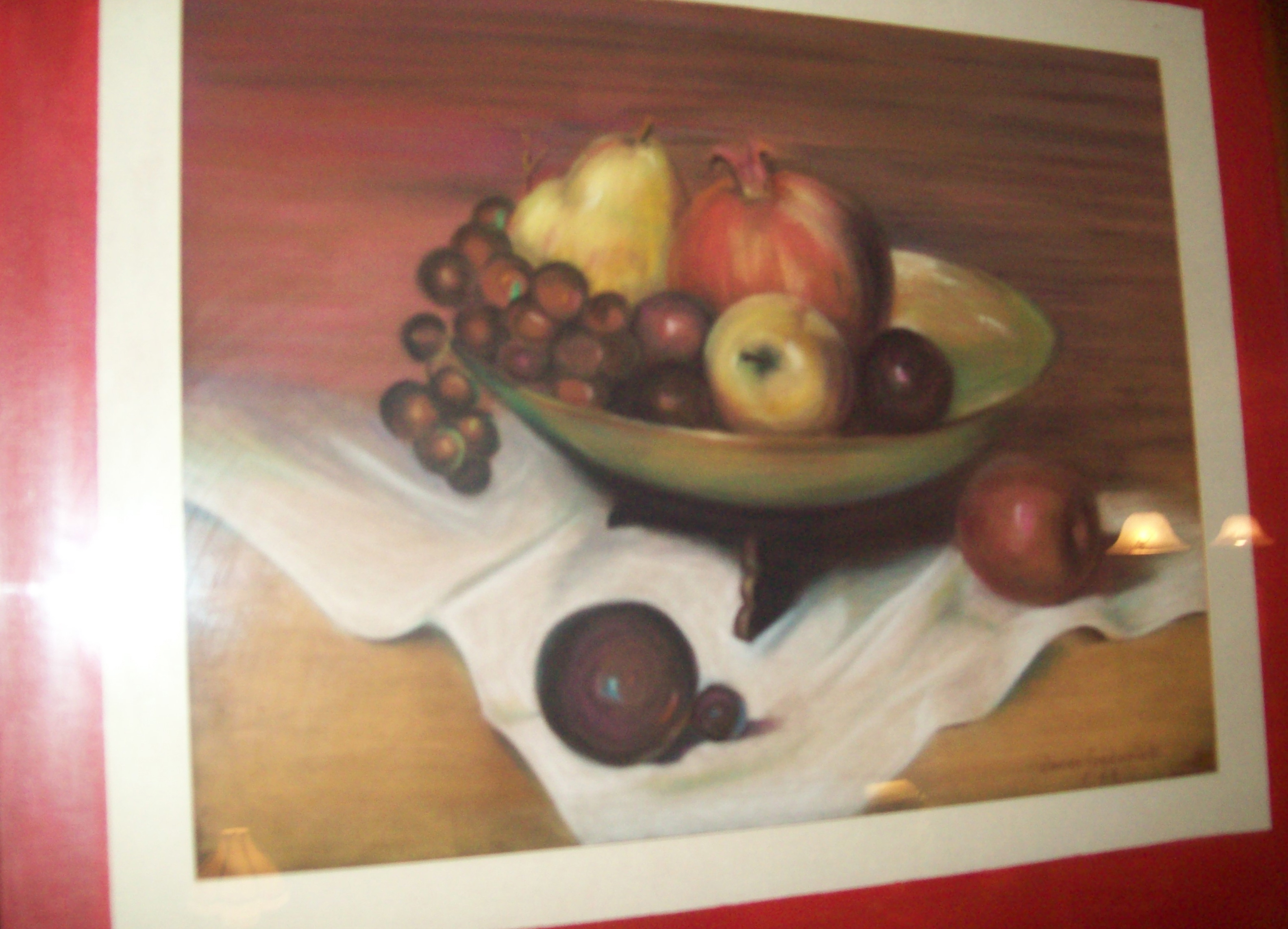
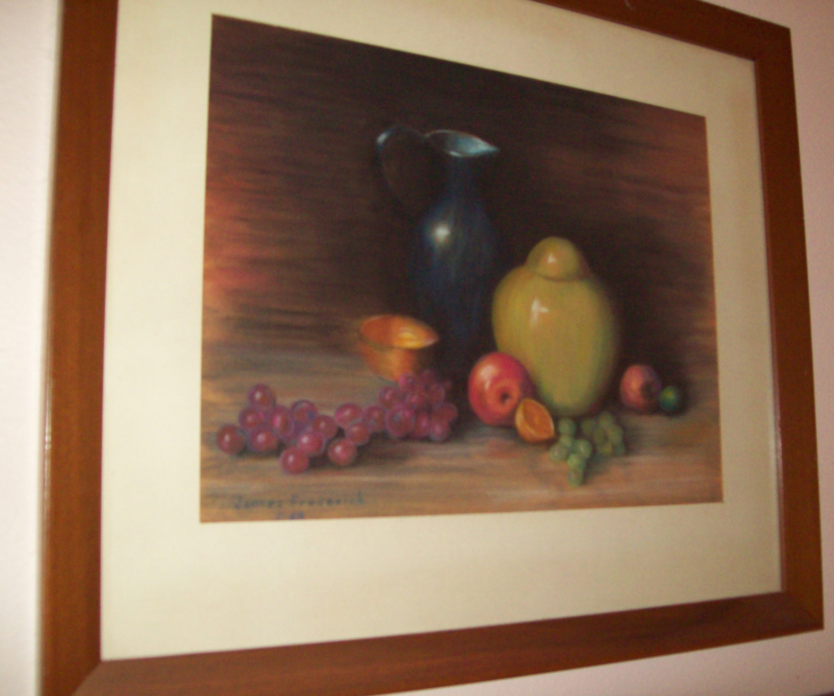
James Frederick: Still Life PastelJames Frederick: Still Life Pastel
Just as Dryden’s poem at the beginning of this post mentions, when the tree falls, the roots live on. His grand-daughter, as well as mine, Olivia, has shown that the art of the Frederick and Burton family will live.
Olivia: Kingly Beast (Graphite on Paper)Olivia: Untitled
For some more of Olivia’s works, check out the Burton Family gallery.
Be sure to join our newsletter. You might win a beautiful art coffee table book, Splash 14.
Visit the Great Opportunities page at the top.
Like us on our Facebook page at the right.
Feel free to make comments at the bottom of the page…no profanity or spam. Please.
“What are some of the ways I can earn money from my art?” This question is asked by many artists, not just students of art. Many talented artists would prefer to make a little money on the side with their art talent rather than having to get a full or part-time regular job to support them, freeing up the time to chase their dream of doing art their own way. Below are suggestions of where to find art jobs to help get you started.
These are simply some of the ways of getting art work. They are suggestions only, but I hope they are ideas that will stimulate you. Keep in mind, every art job is different and you need to make your own rules as you look for available jobs.
Pricing will have to be your decision. You will have to use your bargaining ability to get as much as you can. However, remember that there is another talented person trying to get the same job; but don’t let that intimidate you. Sell yourself, as well as your talent and ability. Just be smart enough not to price yourself out of business. Time and effort will have to be considered to build your part-time art business. However, every community has some art needs which you can furnish. If you give good service to your customers, you will find it will bring yourself pleasure, as well as the much needed added income.
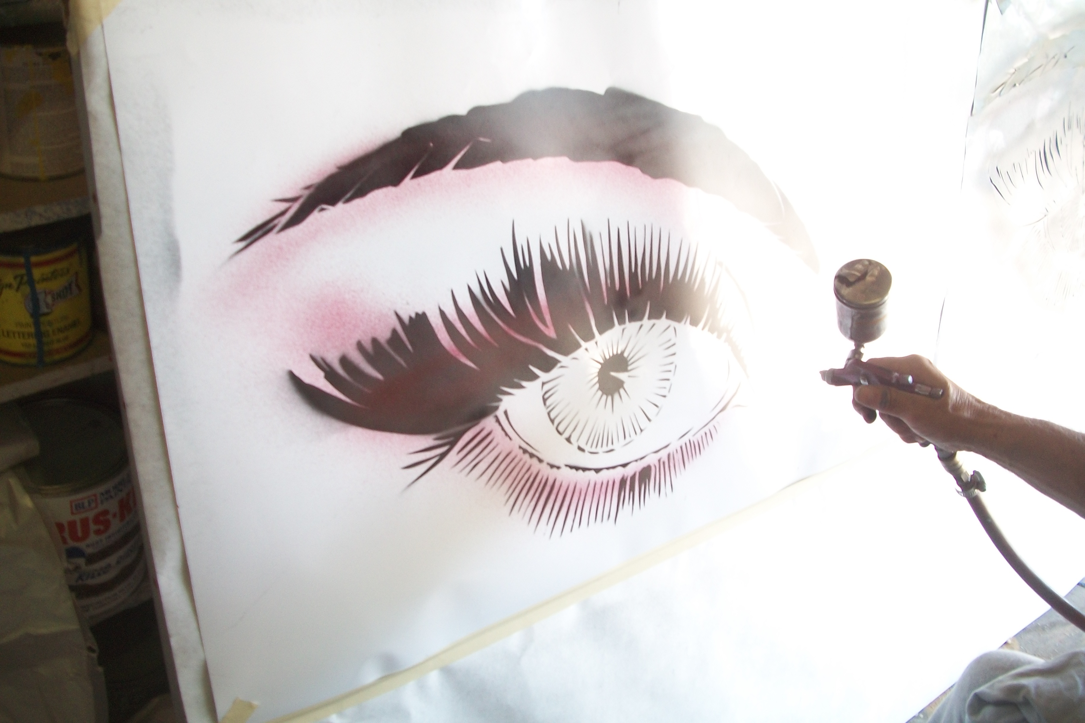
Lynn Burton Air brushing in his studio
Small local newspapers: This is a good source, because these papers are community oriented. They can help in their own purchases, or (more importantly) indirectly through their many connections with people who occasionally call on them for help or advice in buying art. Get acquainted with the advertising manager of these companies. They may be so small that one person (may be the owner) is handling everything. Show that you can be a pleasant relief by assisting.
Churches and Service organizations: Many organizations today use the internet programs to design their newsletters; however, local art often can be much more attention getting. Out of all the organizations ,and churches, and even local businesses that have newsletters are a potential market.
Menu covers: This is an opportunity for lettering, humor, and illustration. How about art that calls attention to their specials? Also, when dealing with restaurants, they may wish to have you customize place mats for them. If they can’t afford to pay you, take pay by letting them feed you. You might just make a better bargain than cash. It’s called bartering. My brother, artist Lynn Burton, barters all the time. My father, artist Arlen Burton, practically bartered everything in his sign business – mechanical work, gasoline, food, I even recall once that he bartered for a car. He was a master at it.
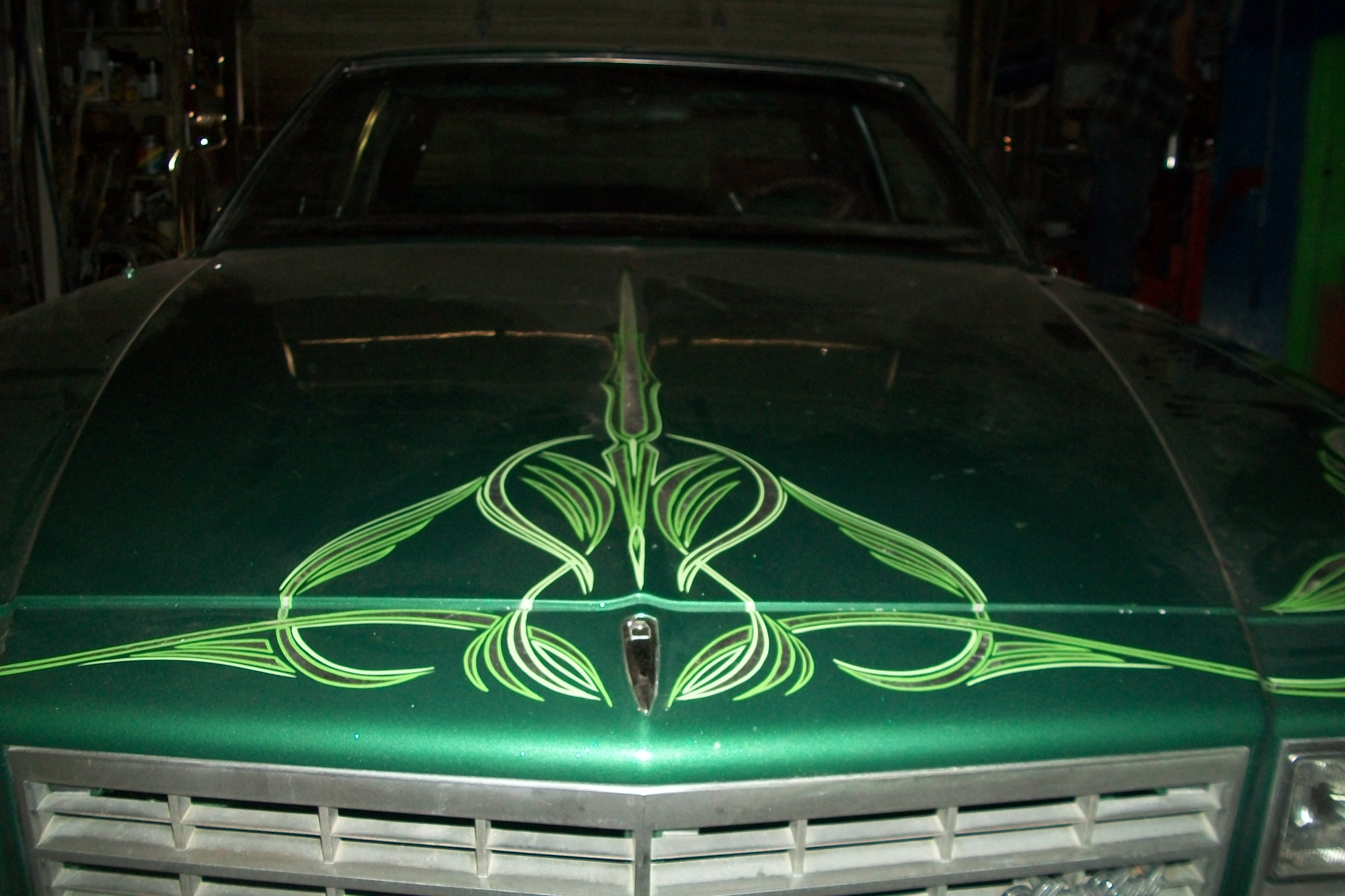
Lynn Burton: Pin-striping car
Pin-striping, painting, and decorating cars: Is there a Hot-Rod club in your community? They can use all kind of art, especially, decorating their cars. Once your “in”, they will be a constant source of money as new members join. Don’t forget to mention T-shirt, and leather jacket art. Lynn Burton has had a constant stream of income from a local hot-rod club in Lubbock, Texas.
Have you considered going to local college fraternities and organizations? If you have silk screening skills, you can have good results that can lead to a consistent part-time art business. The more personalized you present your work, the easier it will be to make a sell. Your competing with a lot of big computerized companies, but if your idea for them remains small and personalized, it can be lucrative.
Small shops, boutiques, and beauty salons are an excellent opportunity for artists: Not only do they offer the possibility of window painting advertising specialties (if inside the window, be sure to be able to paint in reverse), but if you have the talent to paint on material, you can paint handkerchiefs, neckties, scarfs, and etcetera. This offers the owner the opportunity of selling before purchasing on custom items.
Portraits
Place cards
Personalized Christmas cards.
Painted picture plates.
Painted personalized glassware of all types.
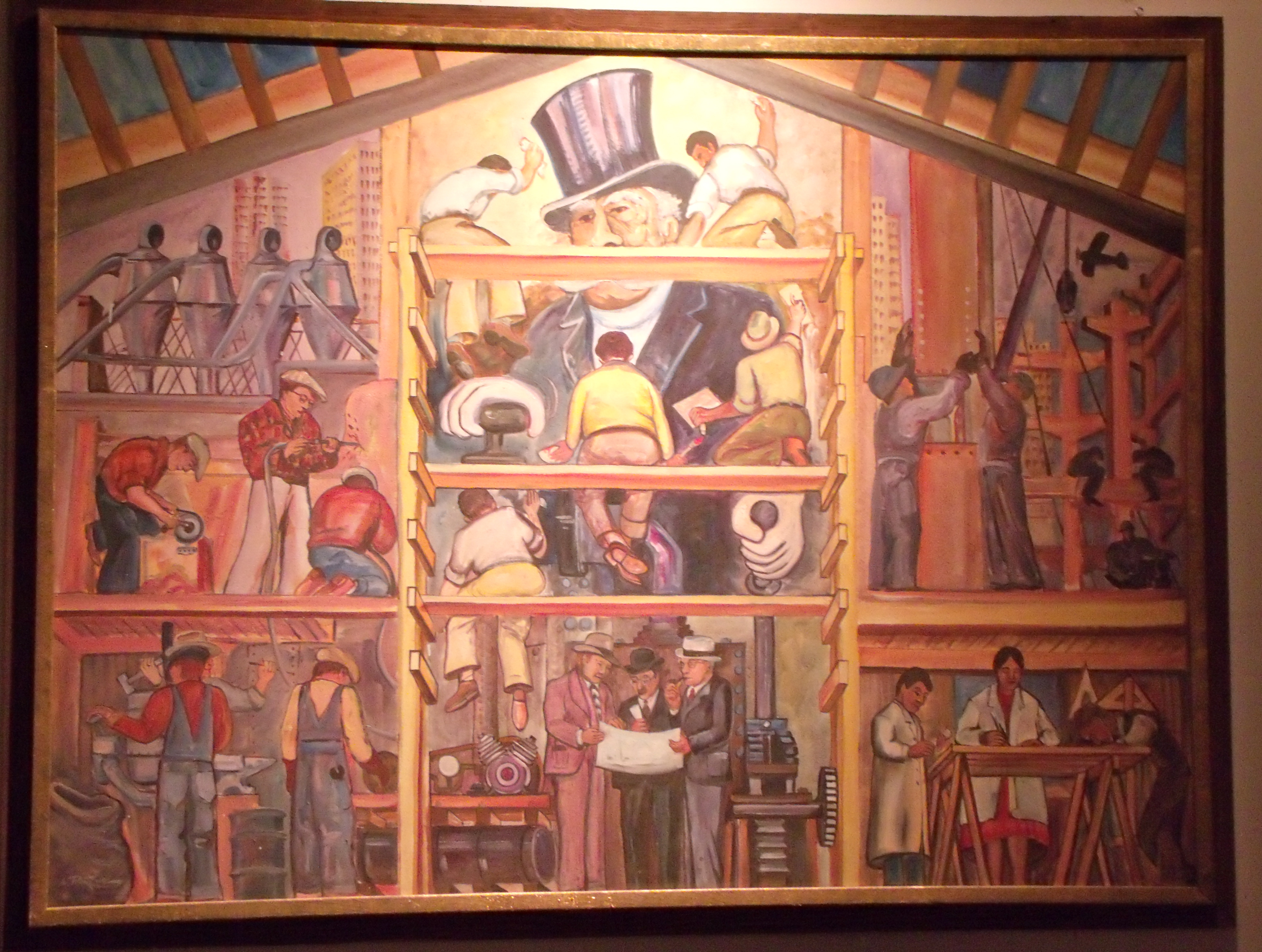
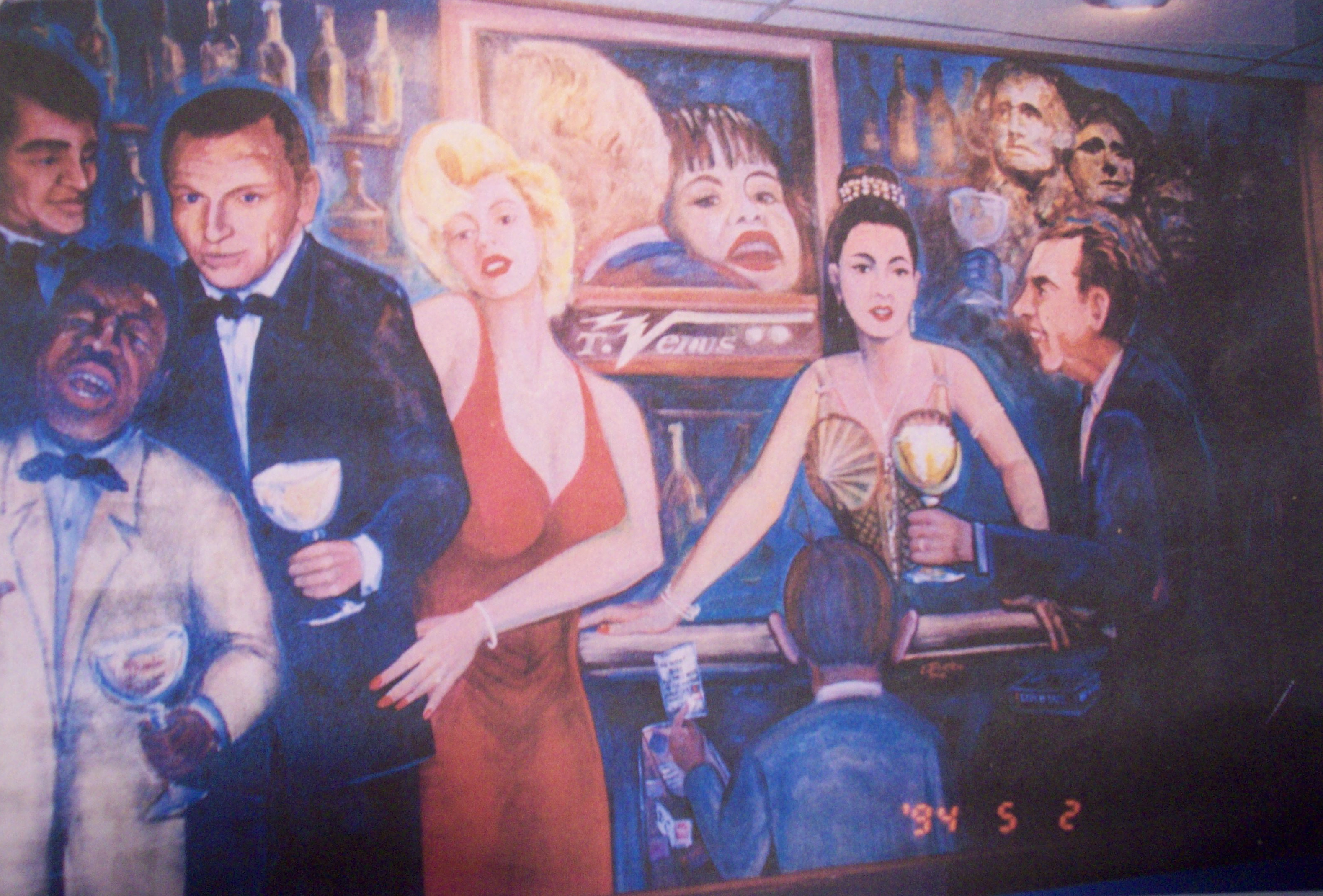
Lynn Burton’s Mural: “Music, Politics, and History”
Do not forget some of the most fun (and hard work) of all is mural painting. Again, you will be competing with other local artists when selling the project. But look at the opportunities available. Many businesses wish to have a painted history of their business; such as, restaurants; hotels; stores; clubs; pubs; manufacturing companies; and almost any business existing that has space for a mural. It can be large or small. It can be a mural on the outside of the business, or one (or several) on the inside of the business. Is it lucrative? Ask the artist that painted wall art for the Face Book company. He accepted stock instead of money (barter?). If the news reports that I heard about this are true, he made an exceptionally lucrative thing. Of course, we can’t all expect something like this to happen, but bargain carefully.
The above are some ideas of the possibilities. They’re mere suggestions. If you are creative enough with your marketing, you should be able to do work that corresponds with your desire to be a fine art artist. Remember, the more you do, the more your name and art is out there among the public. That start up restaurant in your community today may become the restaurant of the future with locations all over the country. The owner may remember you for their muralist, table mat artist, or may even someday afford that expensive piece of art that you’re selling in one of the fine art galleries in America.
You can check some of Lynn’s paintings out at the top of the page in his Gallery.
Also, check out the Burton Family gallery.
Be sure to join our newsletter. You might win a beautiful art coffee table book, Splash 14.
Don’t forget, there are some recommended helpful art books and etcetera in the Great Opportunities page at the top.
Be sure to “like” us on our Facebook Page at the right.
James Frederick: “Poppin’ Johnny” Graphite on paper
When visually attempting to define form, value plays the greater part in its representation and perception. The illusion of three-dimensionality is created by the contrast of lighter values next to the darker ones. This is necessary to portray believable forms.
Portion of graphite sketch for painting demonstrating value in scene
If there were but one single light source to help define form, the interpretation of value would be simplified; however, nature presents the artist with more light sources than needed. This is conflicting light that distorts, alters, or destroys the illusion of form. When light is confusing, artists have the right to take some artistic liberties; especially, when random spots of conflicting light breaks up shapes and forms making them hard to define. This is particularly true when painting from nature.
Tip: If more than one light source is illuminating your subject. Select only one for your painting.
Portion of watercolor painting, representing color as compared to value sketch
Many artists feel that detail is the secret for getting viewer’s attention, but it it’s not. What do you think it is? This artists thinks contrast, either in value patterns or layers captures the viewer. In his book, Tom Lynch’s Watercolor Secrets, Tom Lynch said it so well: I want my paintings to stand up and be noticed, to visually entertain my viewer’s and hold their attention. I’ve found that contrasting values, along with a variety of shapes and colors, are the three things that most entertain a viewer. When I want to make a painting more interesting, I put in attention getting value changes…the more the merrier.
Value sketch for “Fishing the Everglades”
Value at its simplest is black and white. Black being the darkest value, white being the lightest value, and a mixture of black and white creating various grays in between to complete the pattern. However, if one wishes not to draw with graphite or charcoal or paint with black and white, then color and all its values, hues, chroma, and directional light become involved. Therein lies the practice of a lifetime for an artist to truly master. Admittedly, it’s all encompassing…all exciting.
R. D. Burton: Fishing the Everglades~Watercolor (16″X28″)
Be sure to check out the galleries at the top of the page. Also, check out the opportunities page for artists. We welcome your comments at the bottom of the page, please no profanity or spam. We also want to invite you to our Face Book page (right). If you visit the page, please “like” it if you do. Oh, yeah, don’t forget to join our newsletter at the top right side of page.
Art Center Information’s Golden Member, Texas artist Lynn Burton, sent us a letter. We felt it was helpful and informative enough to pass it on to our members.
Lynn: I once had a Poloroid camera that I used in the black and white mode to photo my stuff; that is, artwork or murals or signs. This was especially true when I was having trouble bringing the message or focal point out as it should be. Color was not always the answer…value was. The black/white contrast helps simplify the problem. Cameras weren’t around at the time, but we now know why all the great painters of yesteryear used the technique of drawing black and white charcoal or graphite before painting their pictures in color. It was getting the value right. Sometimes, it’s not what you put in…it’s what you leave out. In the words of one of my favorite art instructors, Paul Milosevich, “When in doubt…leave it out!” As great of an artist as Paul is, if it’s good enough for him, it’s good enough for me. When I create a composition, I live by the words of the great instructor. They’re my motto.
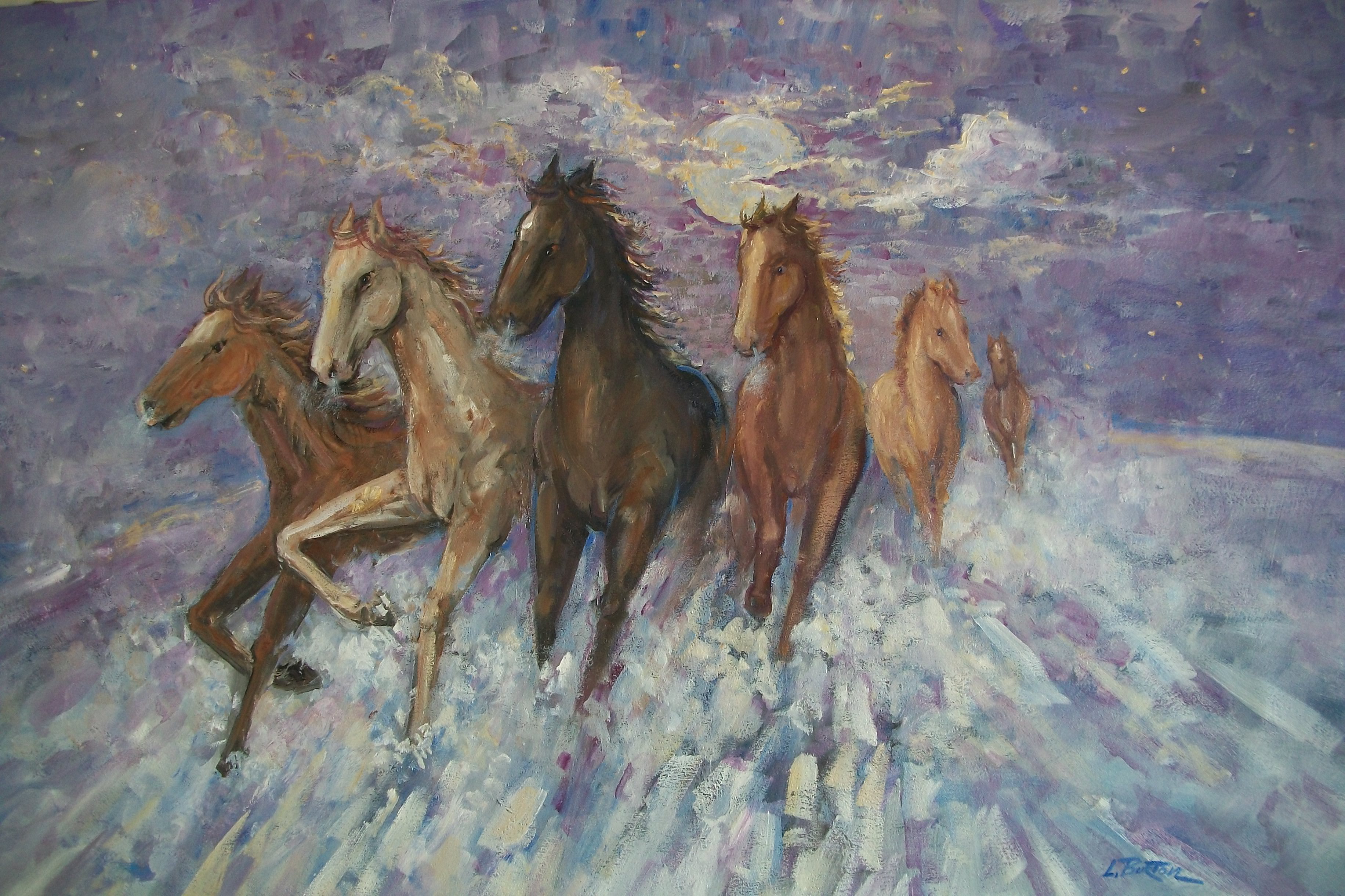
Lynn Burton: Dancing in the Moonlight (oil on canvas)
I try not to throw any of my photographs away because you never know when a new idea comes along and you find just what you’re looking for in your files. Take for example my paintings of horses running and prancing around.
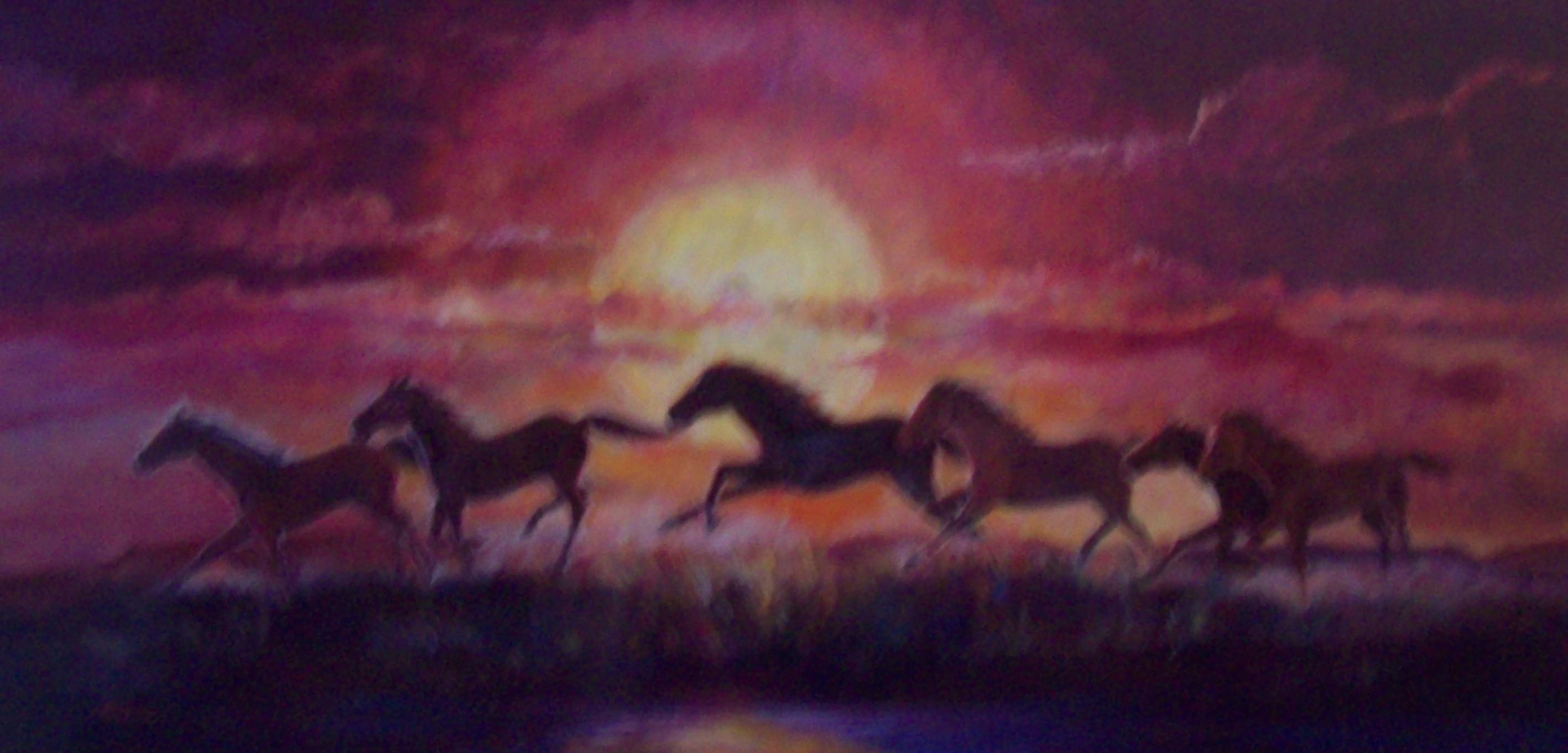
I was in Dickens, Texas (a town about eighty miles northeast of Lubbock) around ten years ago. That’s how long the photographs I took that day lay dormant in the files. Anyway, I was painting a big road sign outside the city limits. The sign asked: Where in the Dickens is Dickens…and it had a great big ? -mark (question mark) at the end. Across the field past where I was painting was a bunch of horses. The exciting part was that at the end of the day the horses began dancing and prancing and playing against a red sunset like only this flat Texas prairie land can have. BAM! This was magnificent!…beautiful! I had to have a piece of this!
Some time ago, I read Art Center Information’s article on back lighting, and it reminded me of the dancing and playing horses from years before, and how the back lighting of the sun affected their image. I’d wanted to paint a picture of them, but had put it off, neglecting to do so. I dug out the photographs and began painting the picture of the red sunset and the horses dancing and prancing, as if they were doing it just for me. That…BAM!…feeling came back as if it were that day ten years before. Later, I liked the subject so much that I painted the horses dancing in the moonlight (seen above). I hardly think there is anything more beautiful as a subject as horses; especially, if they are showing action.
Lynn Burton, “The Red Sunset” Oil on canvass (24×48)
We thank Lynn for his letter, noticing the emotion in his description. We feel certain that concentration and emotion goes a long way to a masterful painting as these two on this page show. We’ve had the photographs of the two paintings for awhile, and we certainly apologize to Lynn for not sharing the letter that came with them with our audience before now. In the future we will be more responsible. Thanks again, Lynn.
You can check some of Lynn’s paintings out by clicking the link, and typing the name Lynn Burton in the search engine http://fineartamerica.com/
Also, check out the Burton Family gallery above.
Be sure to join our newsletter. You might win a beautiful art coffee table book, Splash 14.
Don’t forget, there are some recommended helpful art books and training DVDs in the Great Opportunities page at the top.
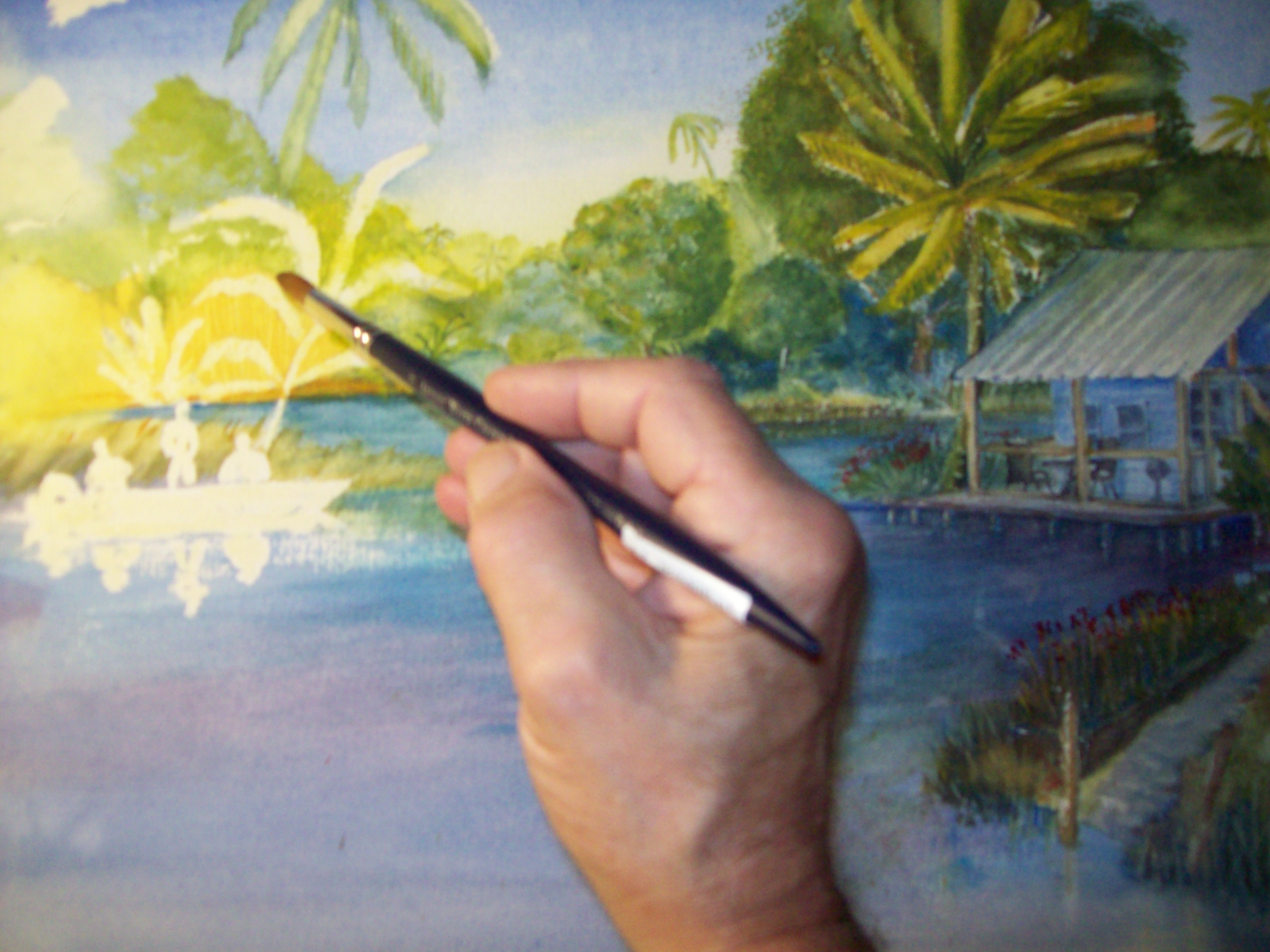
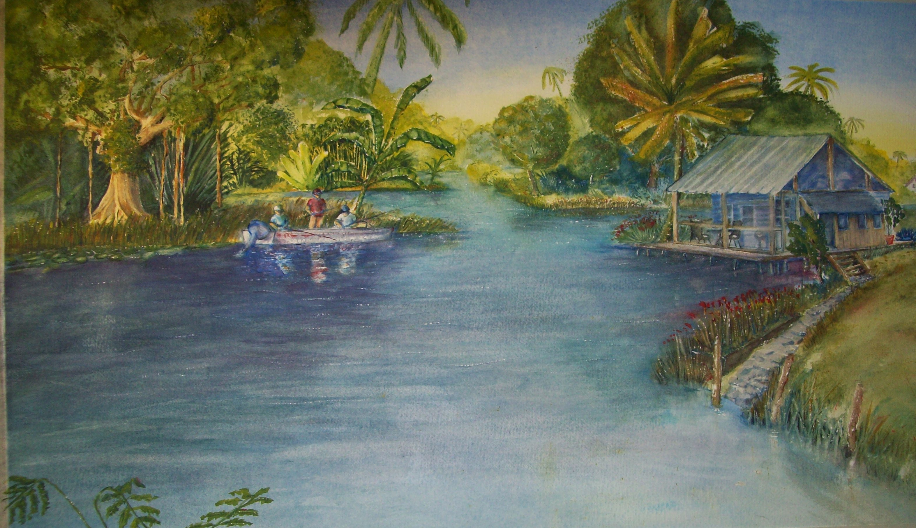
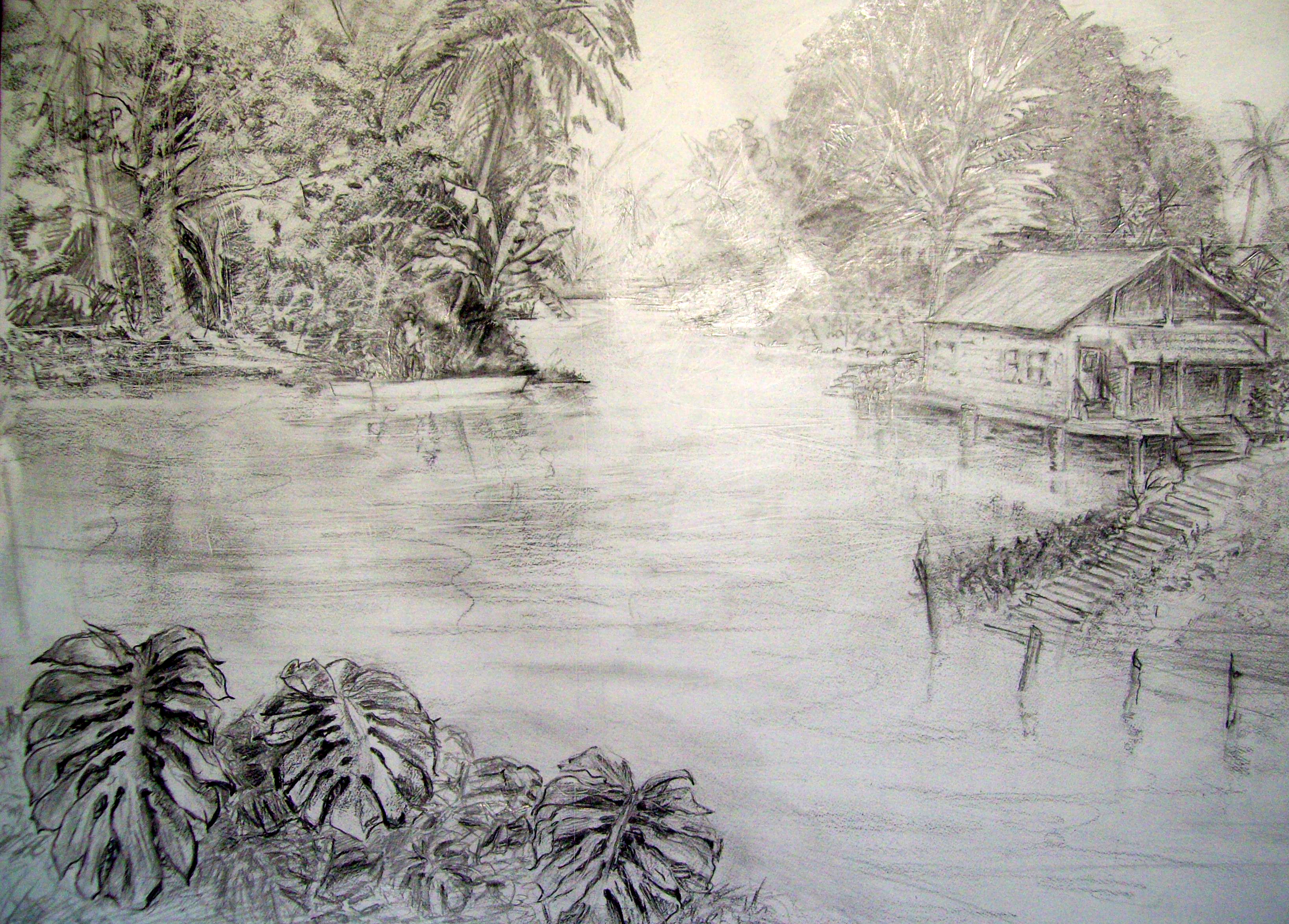
In early June, I posted the importance of doing practice work before attempting your final painting. I mentioned this because I made two watercolor paintings before completing the final work. The idea was to increase the potential for profit. (If you haven’t already read the article, I recommend you do so by clicking on the picture of me painting at the left.) After completing the practice paintings, I am finally finishing my latest painting, “Fishing the Everglades”.
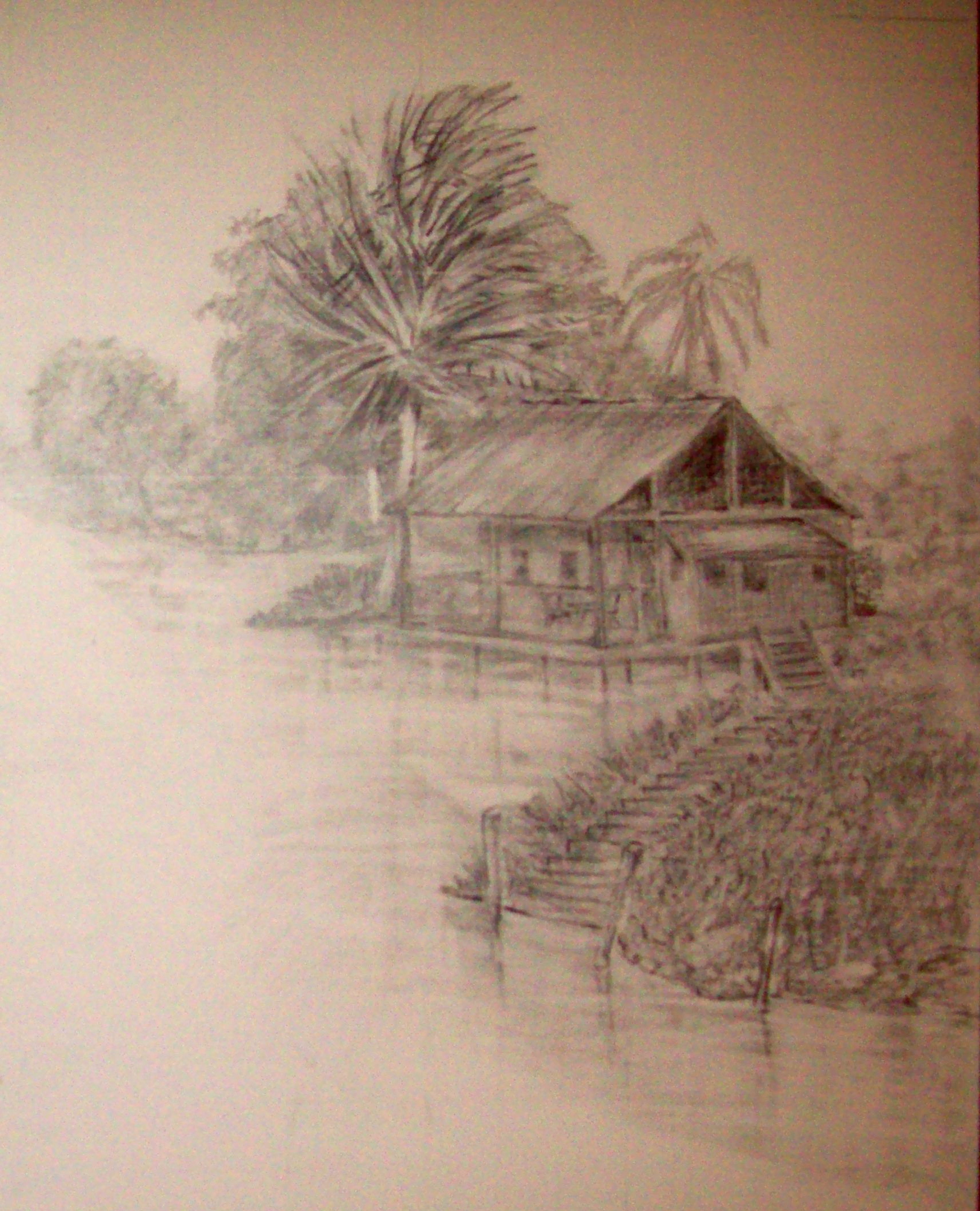
I’ve worked on these three paintings for the past month. However, my goal is to paint at least three acceptable paintings each month. It helps if you can get ideas for more than one painting from one well thought out composition. Without overdoing it too much, I’m going to take the liberty of posting the compositional drawing for the three latest paintings before discussing them.
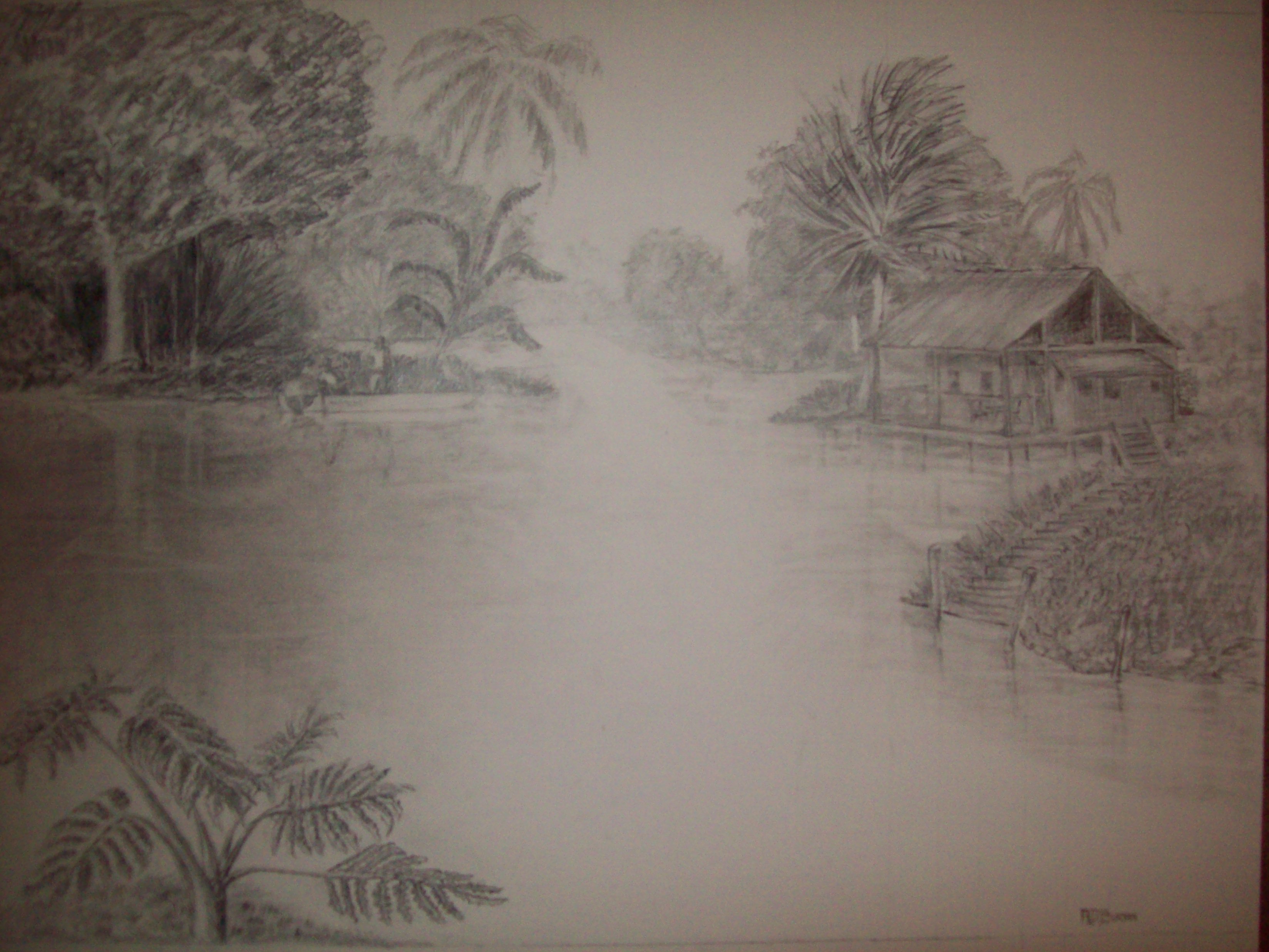
R.D.Burton: Full size Graphite pencil drawing of Glades Fishing(22″X3O”)
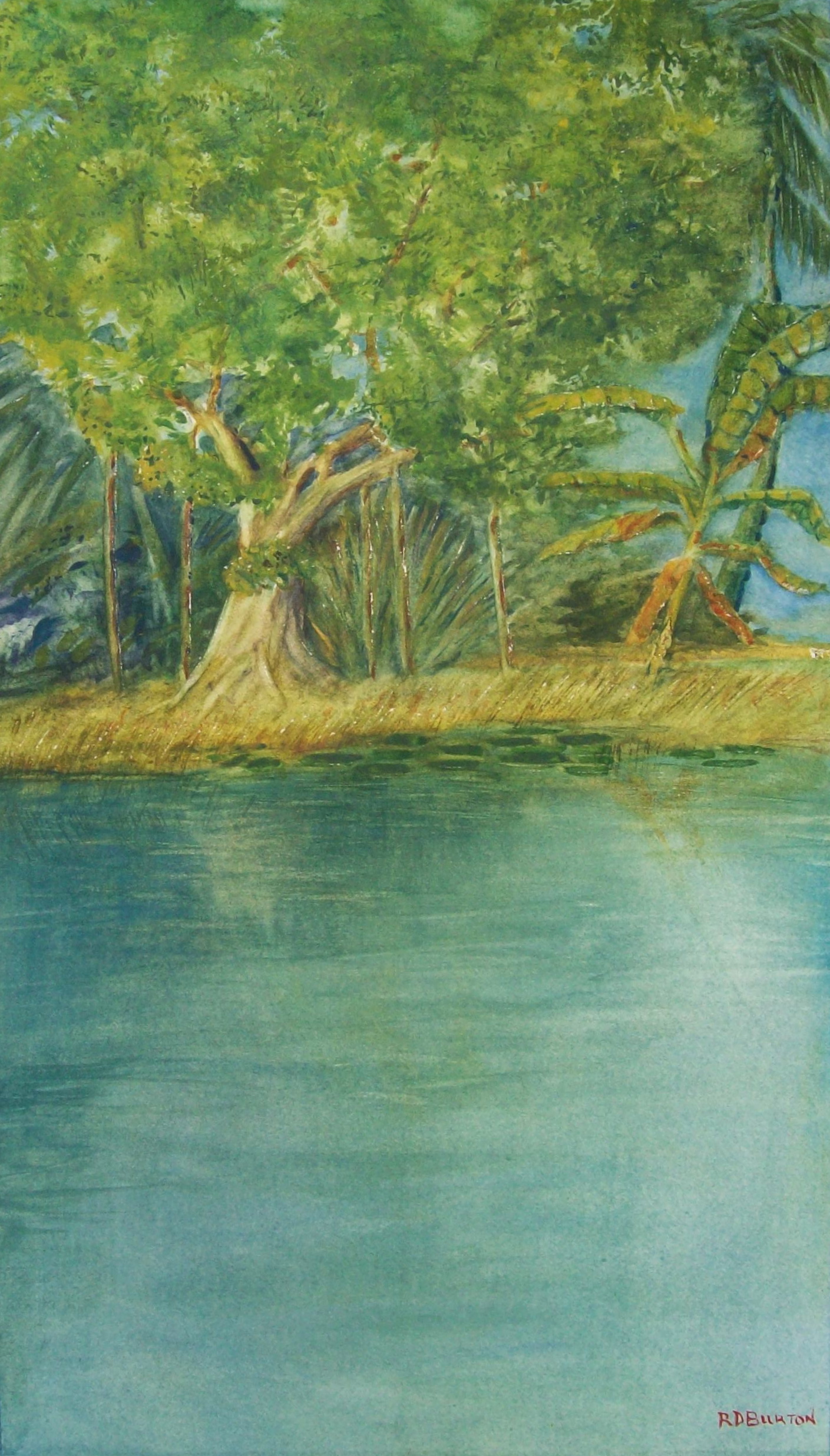
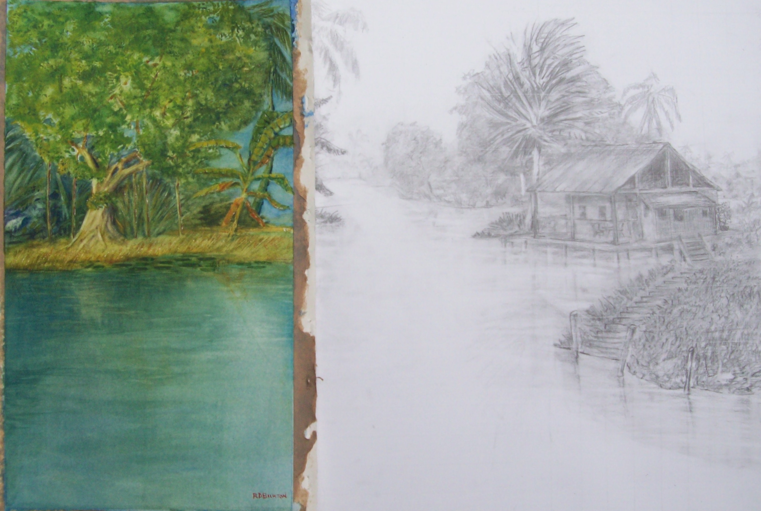
The large graphite drawing to the right is the original planned composition. My first painting was a small section of the overall composition, and was featured in the earlier mentioned blog post in written in June. It was a composition on its own taken from a portion of the larger composition located in the upper left hand side. It shows the Banyon tree and the Banana Tree.
R.D.Burton: Miss Banyan and Mr. Banana~ Watercolor (10″X20″)
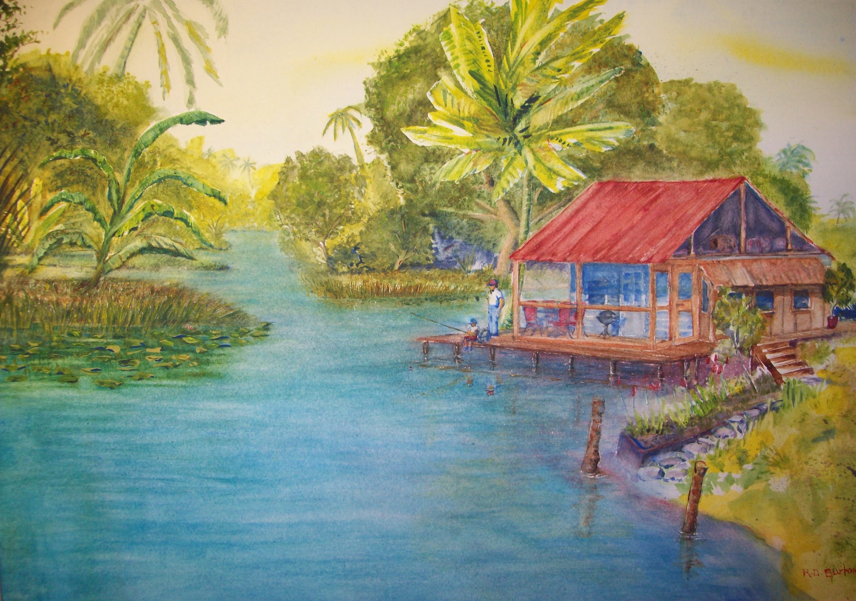
This went well, and I learned a lot about trees and water. However it was a practice well intended, and,most importantly, turned out to be successful enough painting to frame and sell. The second practice painting was the right side of the composition. The point of interest in the painting becomes the cabin, rather than men in the boat fishing. Therefore, I changed the color of the roof on the cabin to make more of an impact area. I painted a small boy and man at the end of the deck, showing the boy fishing. This, of course, is not in the original composition, but helped make it a more complete composition to stand alone.
,
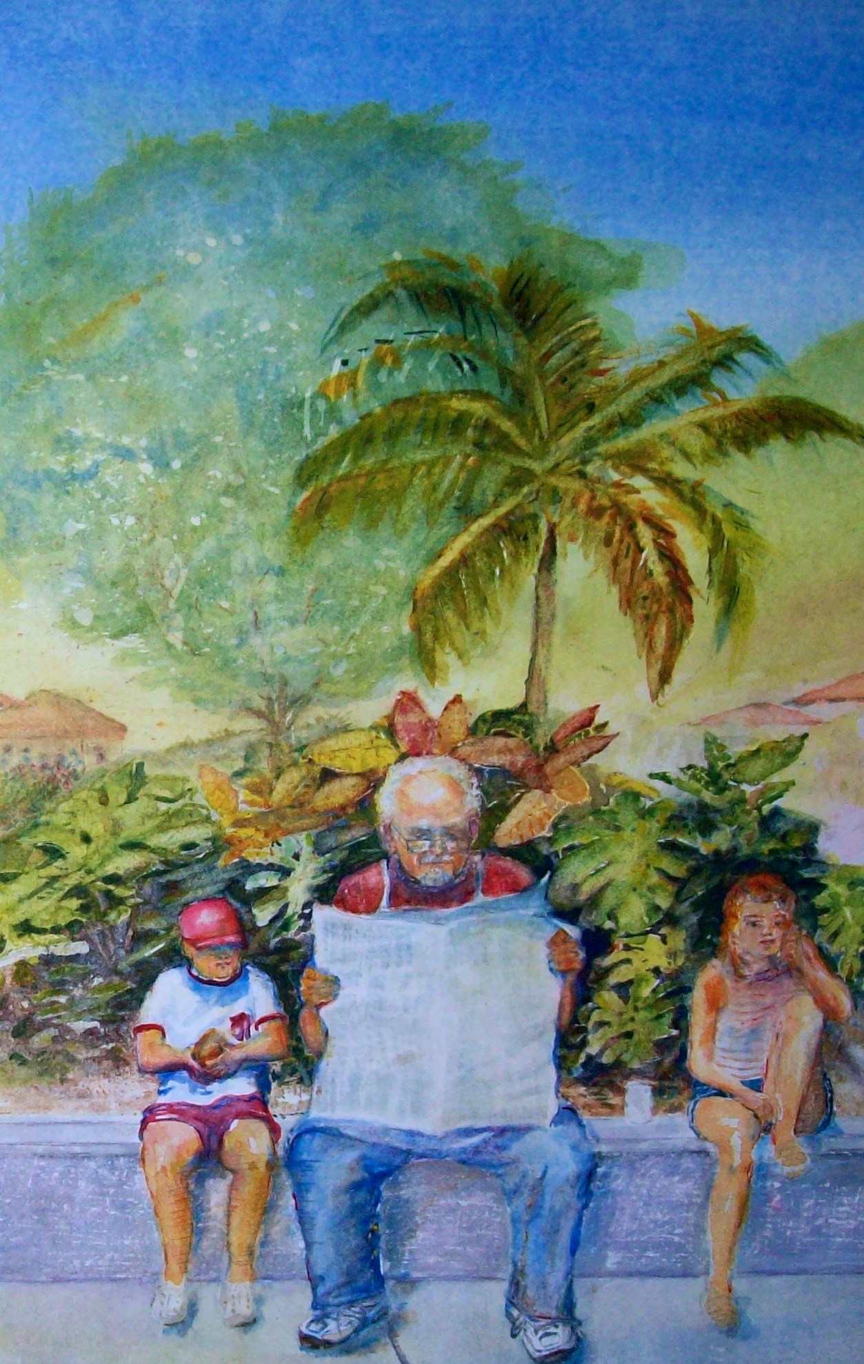
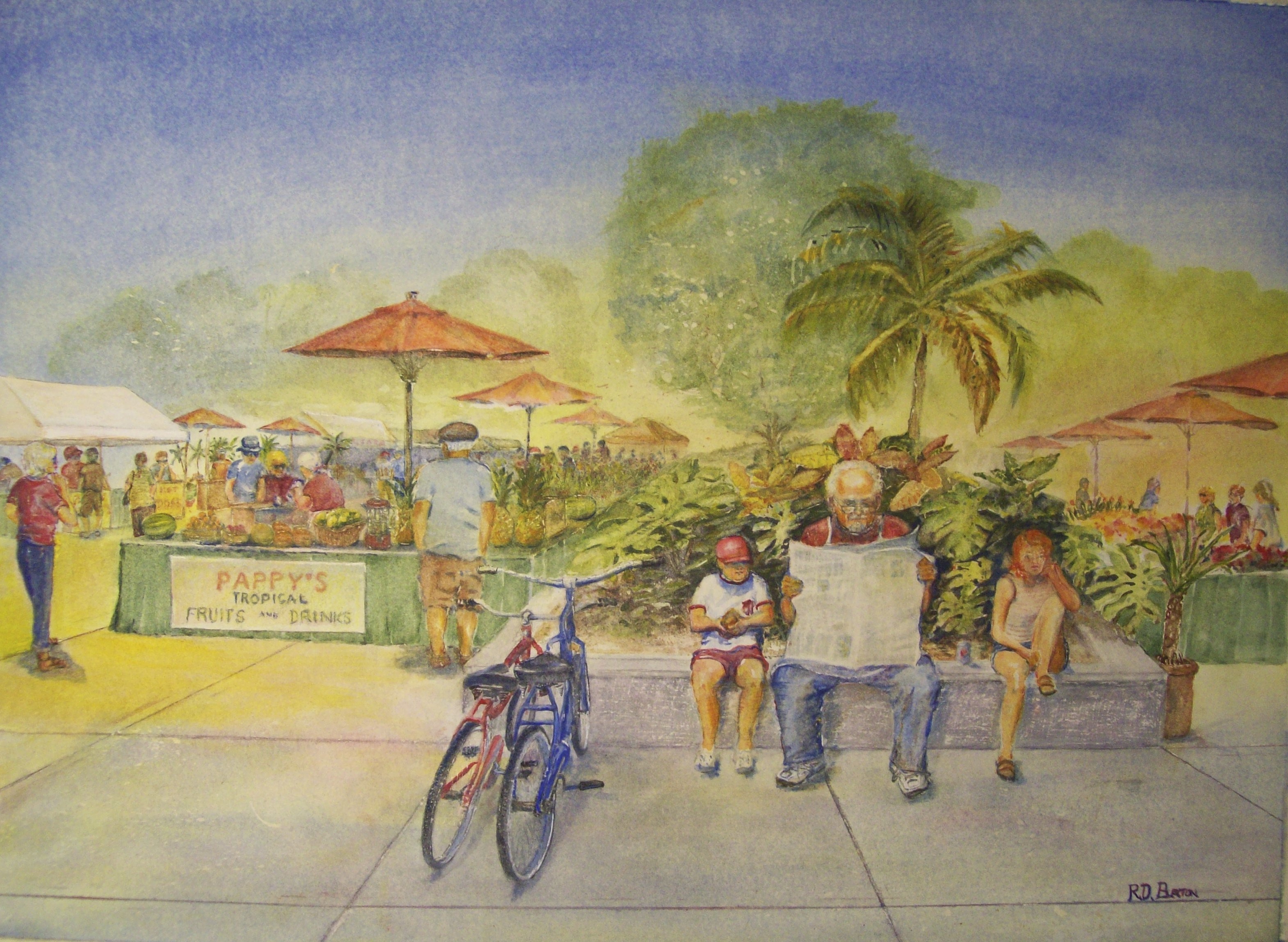
R. D. Burton~”Shopping for Dinner”: Watercolor on paper (14″X20″)
There was a third practice painting that was scheduled, but I began toying with the larger painting, and did not get around to practice the painting of just the three men in the boat fishing. I still intend to paint it, however, I intend to change up the values, making the darkest value the sky and the faraway trees…working it dark, middle, and light. I haven’t a clue how that will turn out.
The large painting below is the composition planned from the beginning. I call it, “Fishing the Everglades.” The painting is really painted as a 22″X30″. However, to fit it with a 24″X36″ glass, it had to be cropped.
R. D. Burton: Fishing the Everglades~Watercolor (16″X28″)
As an artist, if you have a painting that you’ve been working on, and you realize it’s working the way you imagined, try leaving it alone. It may be finished. Although it may be impressionistic, and in an early stage at this point, it may be your best work to date. Think about it; sit on the painting for awhile, and see if you don’t end up calling it finished, and proud to do so.
Your paintings should be an expression of how and what you think and how and what you feel. Carefully, go through the process necessary to decide if you have accomplished what you imagined, and ask, “Will this picture stop the viewers in their tracks?” In other words paint a picture that impresses the viewers.
Richard D. Burton: “Pappy’s Break”~Watercolor (16″X22” on paper)
If you’re not sure you’ve accomplished everything you wanted to in the painting, then do what I call the five finishing tips.
Have you said what you are trying to say?
Did you create an impact area?
Does your picture have depth (changing values)?
Are colors bright and expressive?
Are the shapes in the painting interesting?
You can make up your own points to help you know when to stop painting and call it a completed work, but don’t over complicate it. When in doubt, mat it…frame it…sell it…and go on to the next one.
Lynn Burton: Dancing in the Moonlight (oil on canvas)
A note about technique: Many inexperienced artists will argue that to produce a good painting their primary need is to master technique. Technique is important; however, I feel it takes more than technique to achieve artistic results.
Unless an artists has a great many completed works and art experiments behind them, I suggest some planning be completed before attempting a painting. Relate to the work you’re starting with to other works you’ve done before, or if you have nothing of your own to relate to, then relate to the works of other artists. The relationship with other paintings acts as a guide for compositions. With practice you will learn to control the process, and the end result will not only be clearly defined, but quite often impressive.
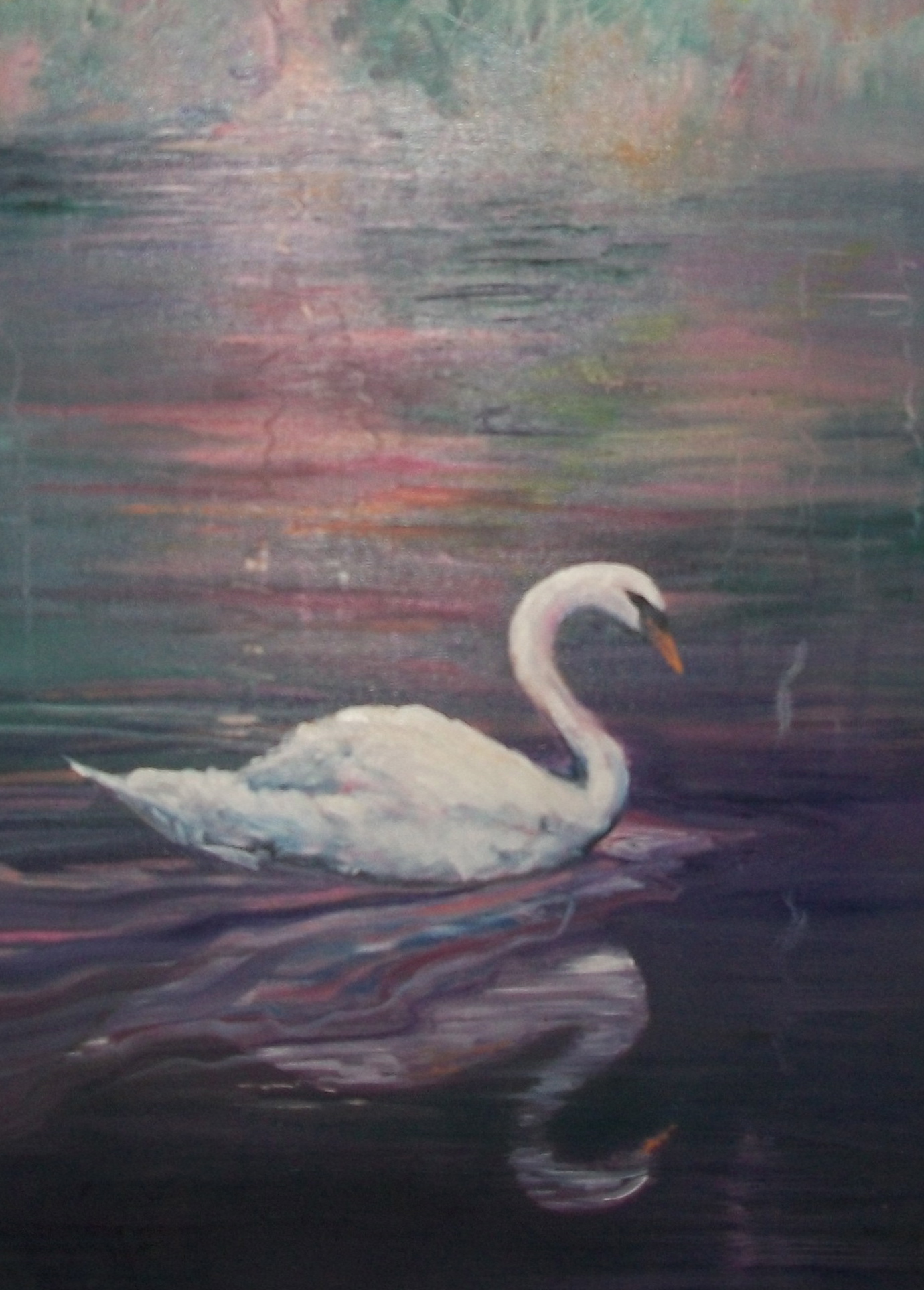
The title of this blog post, Swan Lake Reflections, Miss Banyan and Mr. Banana, is curious enough, but as a visitor, I’m sure you want to say, “What does that mean?”
I guess, the best way to explain it is to discuss a conversation I had with my brother, artist Lynn Burton, when he called me curious about the way I give his pictures names.
“I don’t give my pictures names,” he said.
“I know,” I replied.
“That’s actually not a swan,” he said.
“I know, it’s a goose.”
“Then…why’d you call it a swan?
“Aw…now you’re getting into the method to our madness here at artcenterinformation.com.
“What d’ya mean?”
“It’s simple. We want as many viewers to the blog sight as possible. Very few people will go to Google or Bing or any other search sight and try to look up Goose Lake (I don’t even know if it is the name of a lake); however, there should be over eight million in the last few seconds that have looked up Swan Lake. I’d like a few of those to click on this sight out of curiosity.
“H-m-m-m…that’s interesting.”
“Yeah, more people will see your painting, and that’s what we’re trying to do here…get more visitors. I named the last painting I completed Miss Banyan and Mr. Banana. I don’t know if it’ll work, but I hope to get some of the four million in the last few seconds that looked up Banyan tree, or the eighty-six million in the last few seconds that looked up banana to come to our sight out of curiosity. Who knows?”
“Wow, I don’t know a lot about this computer stuff, but it sounds like you’ve got a plan,” he said.
“You just keep painting those beautiful pictures. I’ll do the promoting,” I replied.
R.D.Burton: Miss Banyan and Mr. Banana~ Watercolor (10″X20″)
R.D.Burton: Full size Graphite pencil drawing of Glades Fishing(22″X3O”)
I recently posted a blog discussing the different steps I use to finish a painting. By using the steps, it often ends by producing more than one complete work of art for sale. This is the importance of making practice paintings for the final work. I will use the work (on the left) that I am presently doing to give you an example of what I mean. (If you click on the drawing, it will only take you to the blog posted to explain the drawing instead of increasing in size. All others on this page should enlarge the pictures when you click on them.)
The completed graphite drawing drawn to size (22″X30″) shown is the third of a seven step process. (One: rough sketch…two: several value sketches.) For all practical purposes, this graphite drawing can be framed and sold. I’m sure you’ve been told by every art instructor in the world, never throw anything away!
Another important step is next. That is a realistic painting in pastel or watercolor of different segments of the painting. This often will produce different completed, framed, and salable paintings; thus increasing the value of your original composition. Since the completed painting is to be a 22″X30″ watercolor, I will make smaller but full size segmented practice paintings in watercolor.
Below are three compositions taken from the drawing above that I will use for practice (and hopefully make complete paintings).
R.D.Burton: Miss Banyan and Mr. Banana~ Watercolor (10″X20″)Segment of Drawing (one)
The first of the three practice paintings is complete. Compare left to right, and you will see the similarity.
The men in the boat fishing were intentionally left out of this practice painting because they will be in a painting of their own.
When I lay the painting over the drawing, It gives me an idea of how the overall painting will look.
Laying painted segment over the drawing
Believe me, y0u will have the opportunity to correct a lot of mistakes by making the practice paintings before you attempt the final paintings. Again, if you’re lucky, you will be able to frame and sell the practice paintings by themselves; thus, increasing your pay for work ratio.
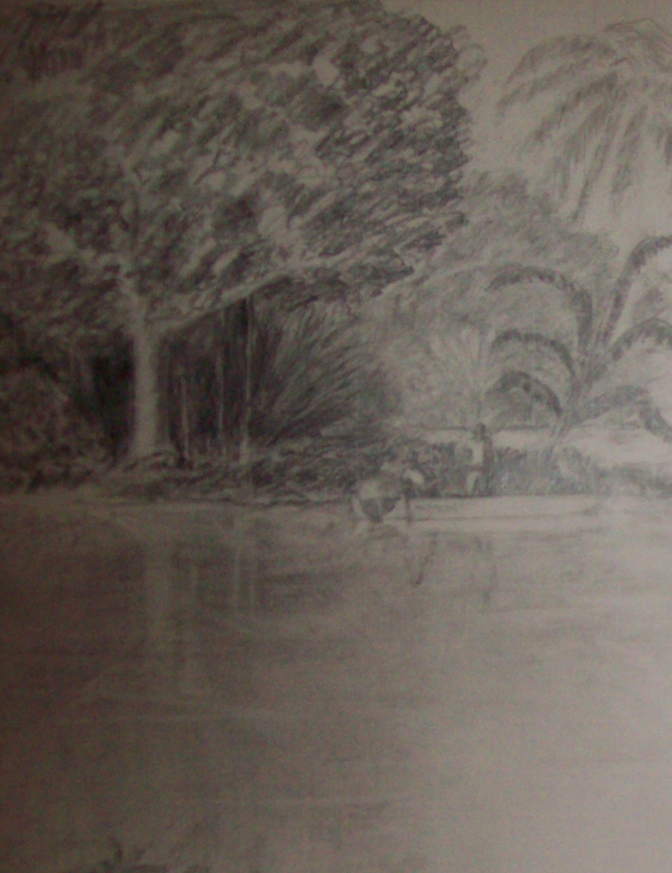
Right-hand segment of drawing for practice painting
The practice painting I am presently working on is the right hand segment of the drawing. This one is so important because it will consider the entire concept of value – the foreground, mid-ground, and background. The color of the water and its reflections will have to be considered carefully, because it will have to fit into the other painting segment. However, there can be several different colors used since it is open and extending far into the background (for example, yellows and purples). With these colors (if it works), it may possibly help make the composition more appealing…we’ll see. But, then again, this is why we call it a practice painting.
So, a practice painting of a segment of the composition can help an artist work out different problems long before attempting the final work…but what’s wrong with making the whole venture a profit making venture?
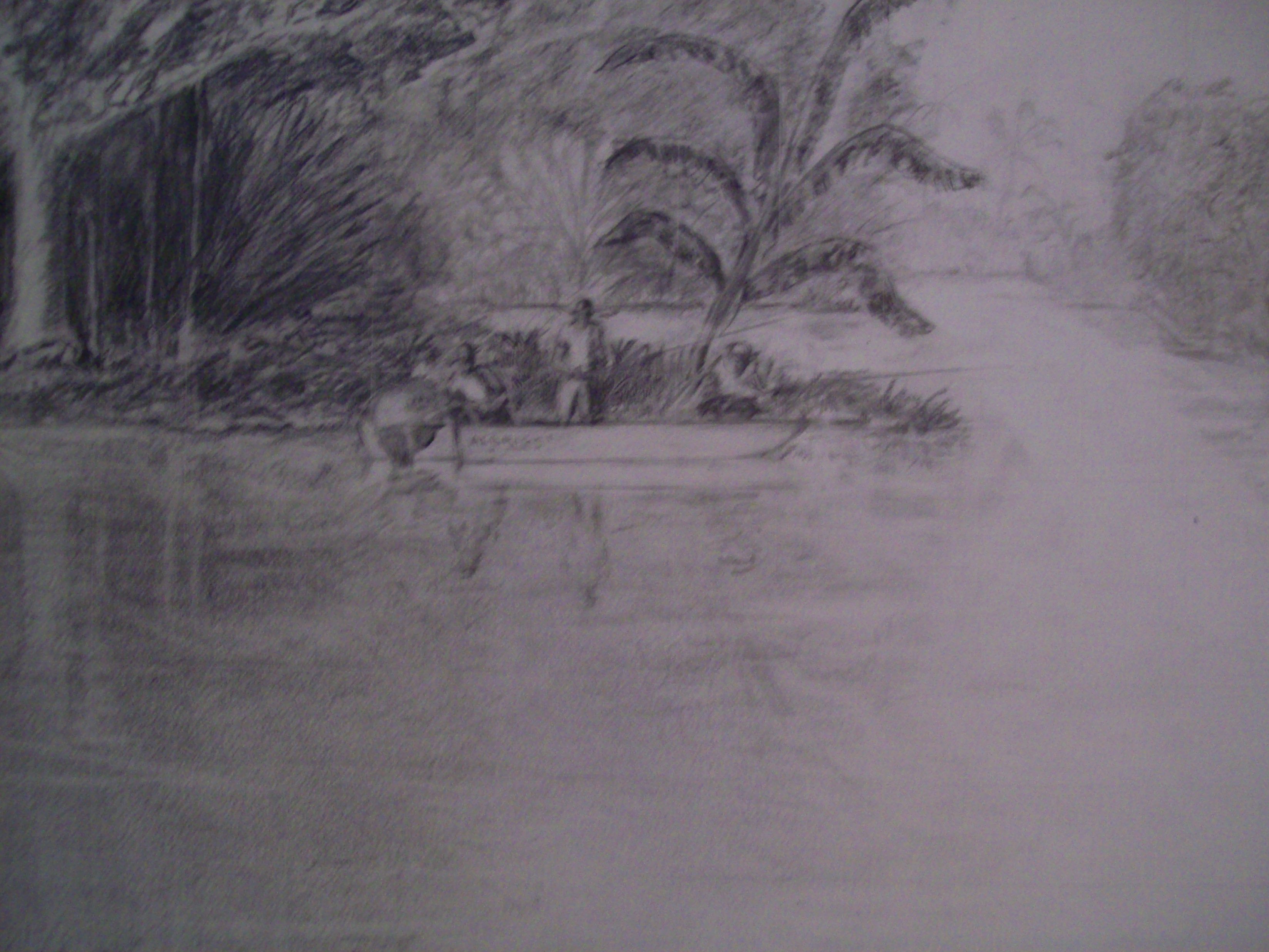
Last segment of drawing to practice paint
Painting number three~As you can see, this is a composition showing three men fishing from a boat. How original is that? There’s been umpteen gazillion paintings of men fishing from a boat…and I don’t care. What does it matter? When I finish this painting it will be an original R. D. Burton watercolor…and you can take that to the bank.
However, I’m using this segment for a more important purpose, not just because it will make a composition. Since the overall picture is a relatively large composition, it is important that I make a portion of the composition to be a focus point of interest. I’ve chosen this segment to do just that. However, it will be hard to do unless I impact this segment with certain colors to grasp the viewer’s attention. This will take practice. It’s in my head, but I have to get it on paper.
As you can see, the men are fishing near a bank off to the right, but in front of the banyan and beneath the banana tree. I intentionally drew a second bank with a strip of water farther behind the men. This (hopefully) will help direct the viewer’s eyes to the men. In my imagination, I can see using color to impact the area; for example, paint the banana tree with yellows, rusts (dying leafs), reds, and various shades of green. The banana tree is already directing the viewer to the men by the way it is composed (like an arrow pointing to them). Across the water behind the men there are leafy plants that can be oranges, reds, and yellow…Impact!Perhaps, the hats the men are wearing can be painted with bright colors. Or, A red strip from front to back on the brightest white in the painting…the boat. And then there is another attention grabber…the reflection of the men in the water. What will be important is carefully working out the reflections. If I do it correctly, this can capture the interest of the viewer (some may spend time studying this part just to make sure it is done properly). Again, my main purpose of the practice painting is to work out an impact area that will help entertain viewers when viewing the larger composition. We’ll see. I’ll know more after making the planned practice paintings.
Be sure to enter for our ART CENTER INFORMATION newsletter.
Copyright For Artists: Quick And Easy Copyright Protection
Copyright For Artists Was Written By An Attorney And Jeweler. It Is Over 30 Pages Long. It Contains Specific Illustrations, Graphs, Links, Resources And Information For Artists About How To Protect Their Arts And Crafts.
Click Here!