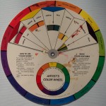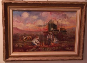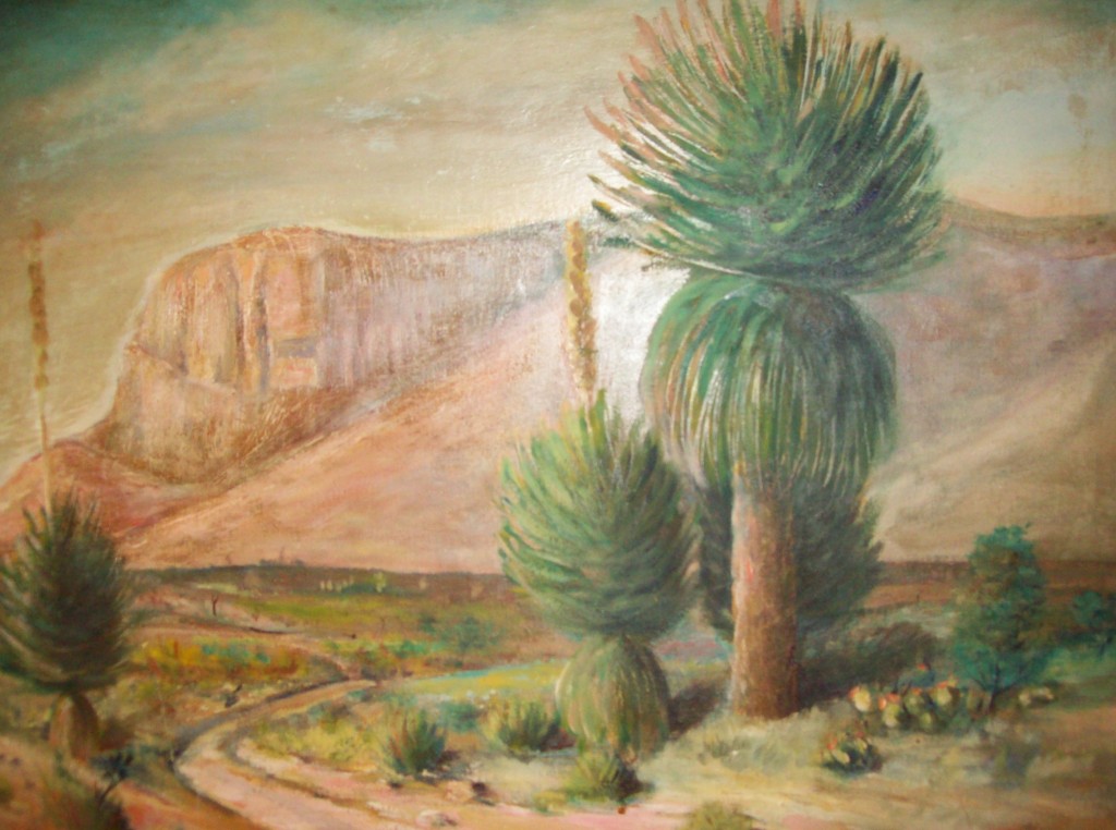
The secondary color scheme using green, orange, and violet are especially good at creating harmony, especially, when painting landscapes. Proper use of this scheme can give a viewer that inviting feeling of being able to walk right into the picture..
However, when using this color scheme, it is always best to allow one color to be dominant. With greens and orange, you can see how this would be perfect for your nature scenes. The use of contrast builds color harmony and creates interest and exhibits an energy.

Just as complements side by side in a painting will intensify each other, mixing complementing colors will make their complement disappear. In the disappearing stage of the mixing experience, you can take the neutral grays produced and keep them for the painting by creating values and temperatures for it. Also, depending on the hues of the main colors and the amount of your mix, you can make several interesting colors.

