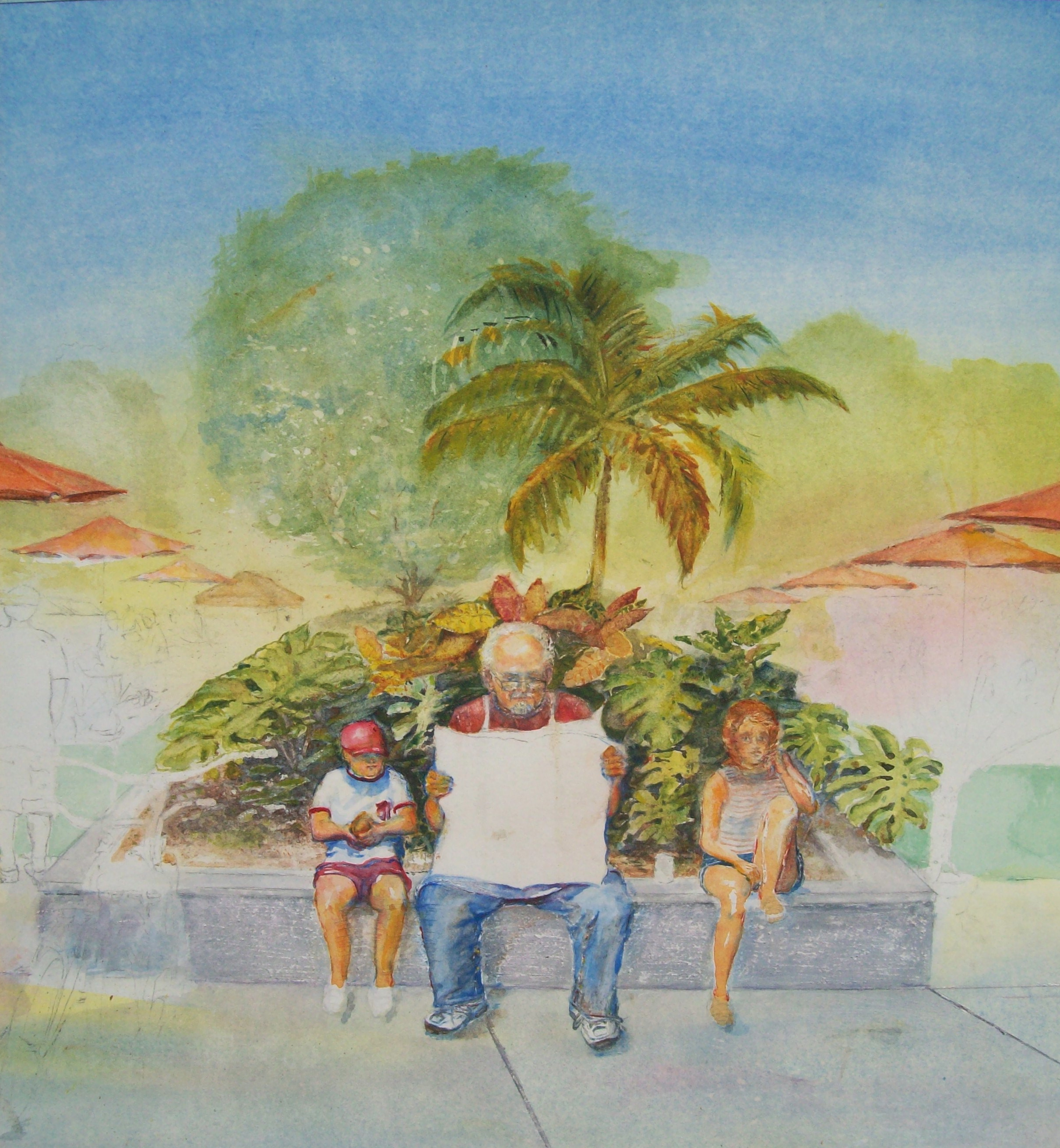
In my paintings, I like to consider the different ways of leading the eye of the viewer with color and light. The unfinished painting on the left is one example of this. It shows the red umbrellas disappearing in the distance on each side of the main focus of the painting. This, along with the sheen of sunlight reflecting off the top of the characters’ heads, helps direct the viewer’s eyes. Almost certainly, color is the most obvious and elusive element of light.
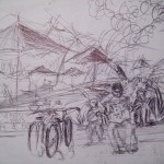
When I loosely sketched the street scene while on vacation in Florida (right), I knew the red umbrellas reflecting the temperature of the sun would make good directional references. Reds, yellows and oranges typically give the impression of warmth. However, the temperature of any color relates to surrounding colors. Keeping this in mind while trying to create a composition that leads the viewer’s eye with color and light becomes a difficult challenge.
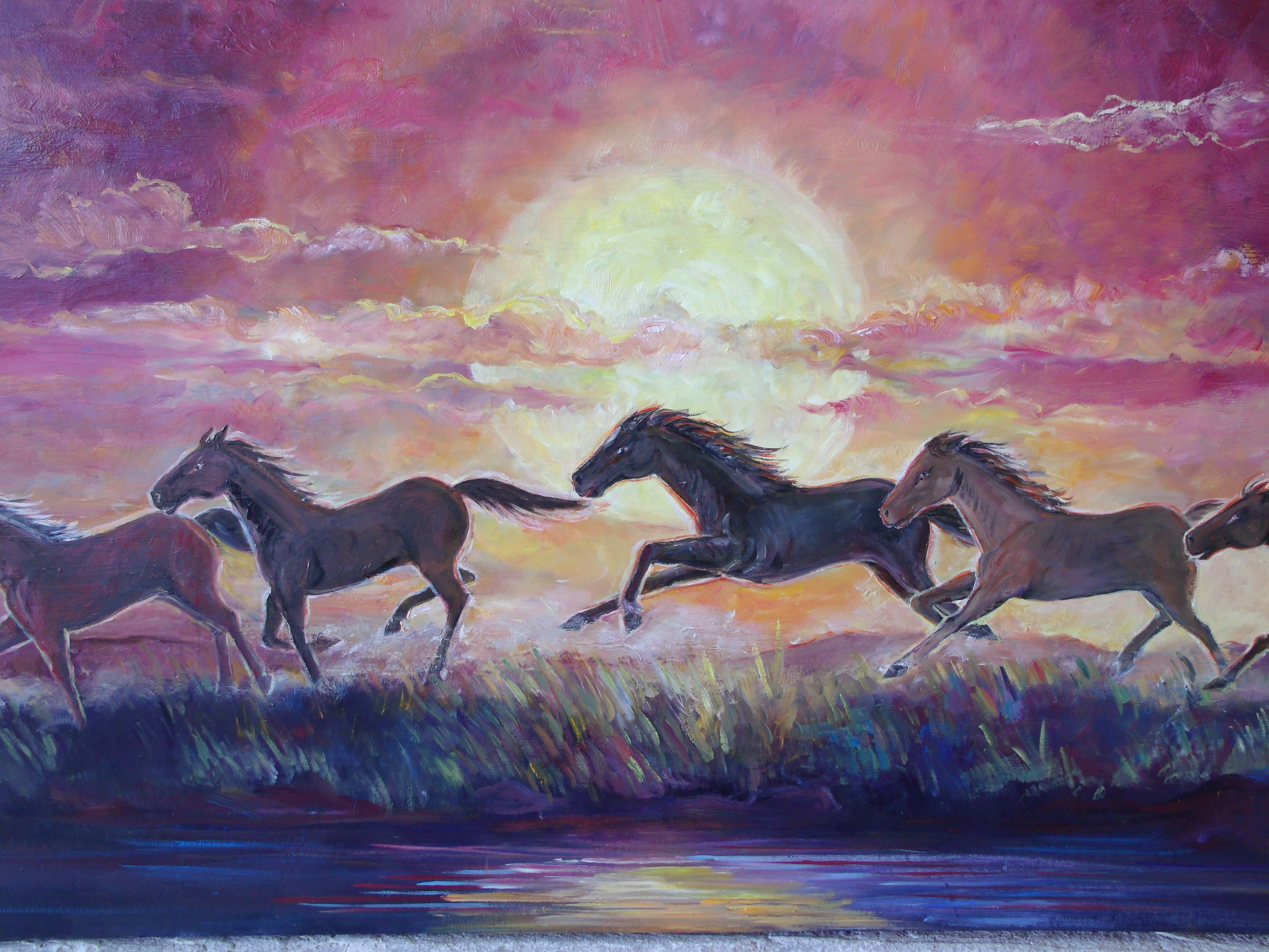
Colors tend to expand and contract as they interact with each other. Placing certain colors next to each other will enhance their dimension. Placing complementary colors next to each other causes one color to come forward, while the other recedes. This creates a pulsating rhythm. Here is a tip to keep in mind while painting: When the light is warm, everything it touches is perceived to be warm; however, warm color surrounded by cool colors will draw the viewer’s attention. A good example of this is seen in my brother’s painting, The Red Sunset. Cool colors in the shadows will always help balance the warmth of the subject.
When attempting to use color and light to direct the viewer’s eye, I try to contrast visual relationships between objects by concentrating on colors, values, size, shapes, depth and texture. Each and all of these will attract attention; and, if used incorrectly (or in error), they will attract attention away from the main focus. This makes every brushstroke important.
Please feel free to leave a comment about the post. I appreciate your comments whether they agree or disagree with my articles.