
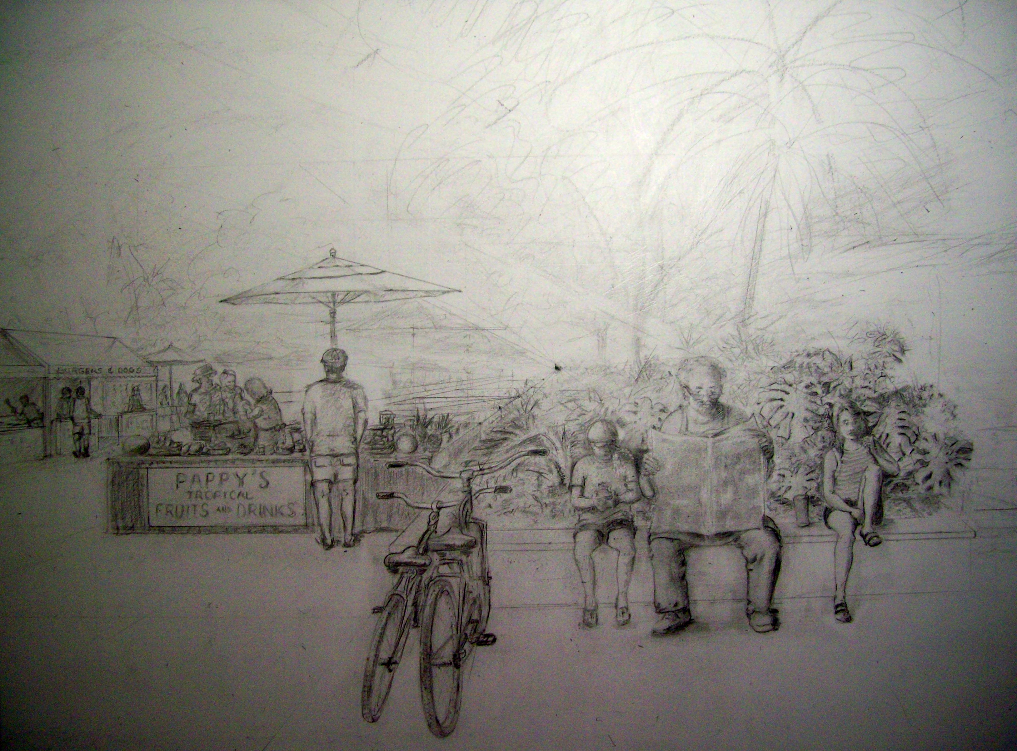
I prefer to use as limited a palette as possible, because it offers more flexibility in creating a range of colors by mixing. In the watercolor painting that is in a state of “work in progress,” I have several things in mind that I wish to accomplish. First, my desire is to create an entertaining painting that is colorful, harmonious, somewhat festive, and that suggests a story.
The palette consists mostly of reds (Winsor Red, Cadmium Red Pale, and Scarlet Lake), Yellows (Winsor Yellow and Aureolin Yellow), Blues (Cobalt Blue, French Ultramarine Blue, Antwerp Blue, and Cerulean Blue), Siennas (Burnt and Raw), and Payne’s Gray.
I usually do not get involved with a composition as complicated as this one, and consider this to be an experiment that has turned out to be therapy. I’m not certain I needed it, but I persist on no matter how frustrated I get. For this reason, it’s coming along while I work on other projects.
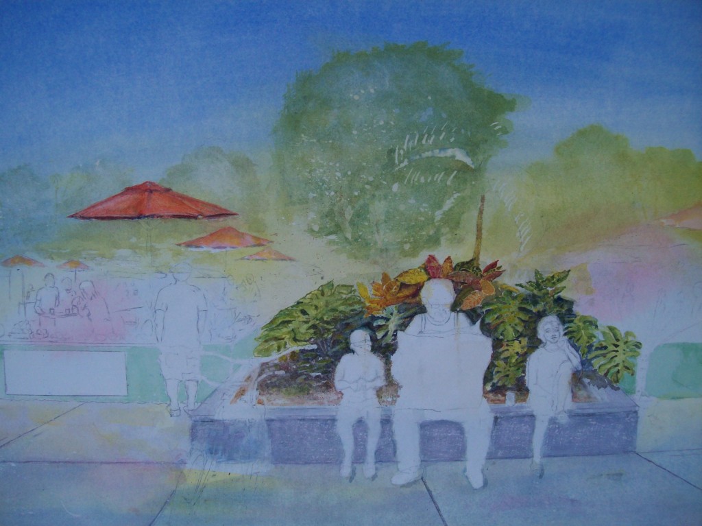
I especially like to mix greens from the palette. I know just using Antwerp Blue, I have at least eighteen different greens (mostly on swatches…not in this painting). In an attempt to get a feeling of harmony, I painted around the entire picture using soaking wet Cobalt Blue on the outer ring, Scarlet Lake dribbled around the middle ring, and Winsor Yellow in the interior.
It took me a while to decide to discard some of the more staining pigments. I’ve completely done away with most all greens, and one of my favorite colors, alizarin crimson. I must be able to ‘lift’ and manipulate paint when it is on the paper. Many of the greens (especially Hooker’s green) and alizarin crimson just will not allow this.